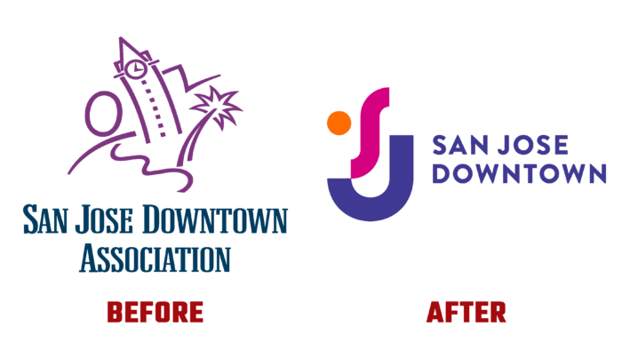
New opportunities and prospects for the San Jose Downtown Association are reflected in a recent brand refresh, an association of more than 2,100 organizations within the BID boundaries working to improve the downtown area. The association is focused on providing street improvements, creating convenient marketing communications, reflecting on important events, and carrying out various promotions that are in harmony with the overall architecture or add to the aesthetics of the city’s atmosphere. Particular attention is paid to cleanliness and safety, the conditions for the profitable development of any business. Founded in 1986, the association constantly expands its capacity, attracting all newly created organizations to its membership. The brand has redefined its visual identity better to reflect its mission, current changes, and developments, presenting a new vision to the residents in a modern, minimalist design.
In the new identity, the brand found a way to reflect its great love for the great city. The last visualization changes were made more than 30 years ago, making today’s change especially necessary to increase the organization’s presence, public awareness, and ability to inspire and attract new members and investment. The main visual element – the company logo, is an anchor in the whole identity system, encouraging all its other elements in a clear and understandable formulation, reflecting the current plans aimed at achieving the goals. The prerequisites were created to create good opportunities for future growth.
In creating the new brand identity, the brand had one important goal: to ensure compliance with modern visualization requirements. The minimalistic style in which the logo was created meets this. Its composition is a symbolic representation of the brand name in the form of an abbreviation of the first two letters of the name. The architecture of the composition created a symbolic image of a human face, complete with an orange circle as a second eye. The image is fun and attractive, which communicates the brand’s humanity, the focus of its activities for people, first and foremost. It forms an attractive and friendly atmosphere, enhanced by the bright colors – bright orange, pink and dark lilac.
The last color is used to execute the text of the brand’s full name, located to the right of the sign. The test is made in a clear font with the same size of letters, each at a certain distance from the other, which ensures its readability against any background, regardless of the size of the sign itself. The original graphic design of the logo makes it easy to remember and recognizable.


