


 San Jose State Spartans Logo PNG
The San Jose State Spartans logo features a stylized Spartan warrior helmet. The helmet symbolizes fighting spirit, courage, and perseverance, reflecting the team’s qualities. The golden color symbolizes success and high achievement.
San Jose State University’s athletic history dates back to 1893, when the school, then known as the State Normal School, established its first sports teams, called the “Teachers” or “Normalites.” The name changed to “Spartans” in 1925, emphasizing unity and discipline inspired by ancient Greek warriors.
The football team grew significantly in the 1930s and moved into Spartan Stadium in 1932. Post-war athletics flourished, with the Spartans winning their first major national boxing title at the NCAA championships in 1948.
In the 1950s, football thrived under coach Bob Bronzan, clinching the California Collegiate Athletic Association title in 1954. Track and field gained international attention in the 1960s, notably when Tommie Smith and John Carlos delivered their historic civil rights protest at the 1968 Mexico City Olympics.
Women’s sports officially joined the athletic program in 1975. Football returned to prominence in the 1980s under coach Claude Gilbert, notably defeating Miami (Ohio) in the 1986 California Bowl. Basketball dominated the Spartans’ sports identity in the 1990s, while the university’s respected judo program, founded in 1946, continued to produce national champions.
In 2006, after joining the Western Athletic Conference, the football team ended a 16-year bowl drought by winning the New Mexico Bowl. Another shift came in 2013 with the Mountain West Conference’s entry, which raised the level of competition.
The football program reached a notable milestone in 2020, capturing its first Mountain West Conference championship under coach Brent Brennan with an undefeated regular season. Over the decades, San Jose State has produced numerous accomplished athletes, including NFL greats Bill Walsh and Dick Vermeil, as well as quarterback Jeff Garcia.
By 2022, facility upgrades, including a new football practice center, reflected the university’s continued investment in athletics and reinforced its regional reputation.
Meaning and History
What is San Jose State Spartans?
These San Jose State University teams, representing a powerful force in the Mountain West Conference, embody the tenacity and spirit of ancient Greek warriors. Dressed in blue and gold, these Division I athletes excel in various sports. Football matches draw ardent fans at the CEFCU Stadium, and swimming teams regularly attract attention at student competitions. Downtown San Jose is enlivened by its thriving sports culture, led by a charismatic mascot that inspires the crowd at every event.
1940 – 1948
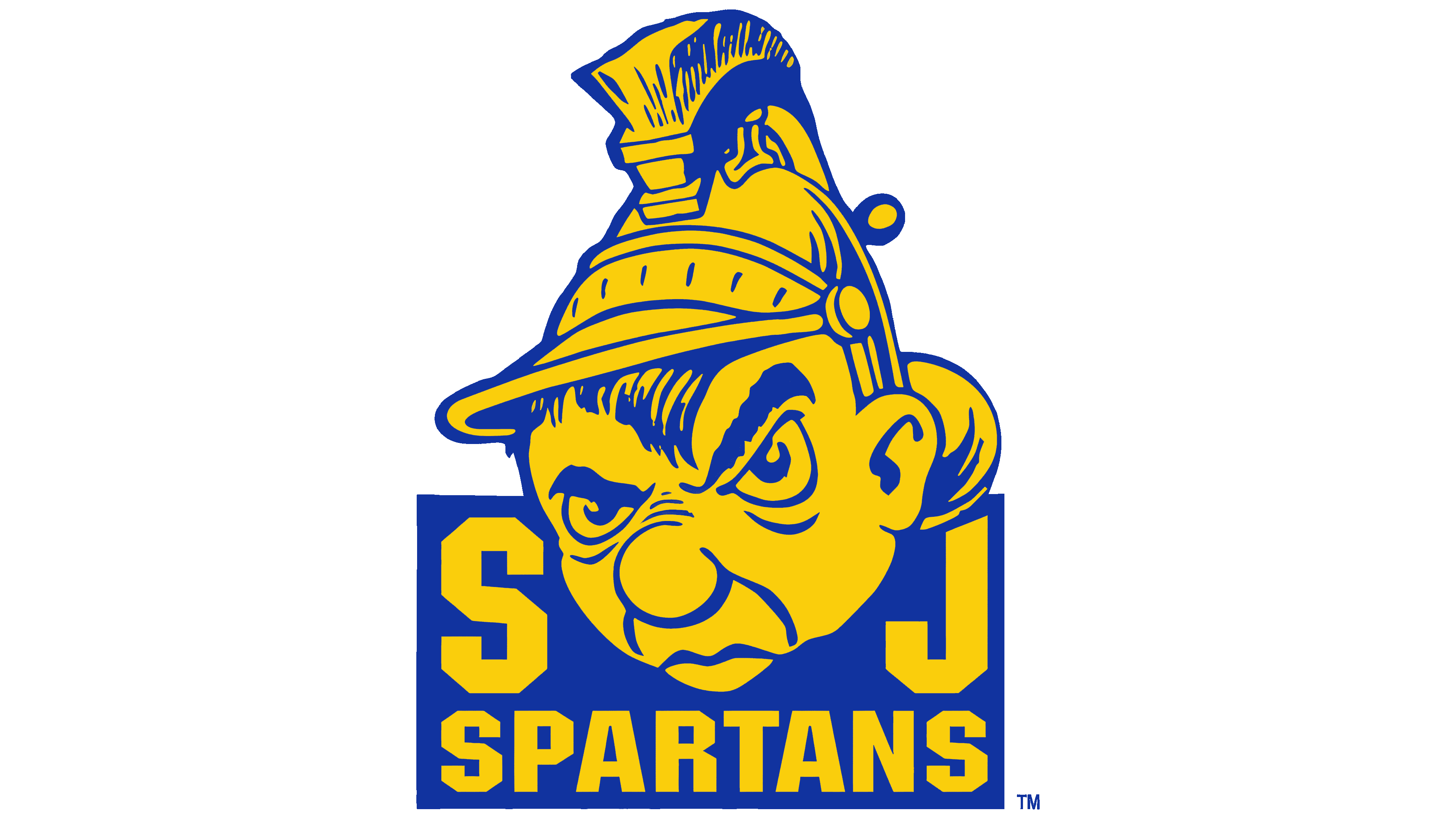
From 1940 to 1948, San José State University used a logo depicting a cartoon-style Spartan head. The character is shown in profile, with thick eyebrows, a large nose, and tightly pressed lips that express aggression and excitement. The character wears a classic Spartan helmet with a distinctive high crest, emphasizing the team’s historical image.
At the bottom of the composition, a blue rectangle is partially overlapped by the Spartan’s head. Large yellow letters “S” and “J” flank the design, representing the university’s name. Below the letters, the word “SPARTANS” is written in large, straight type.
The color scheme features a blue background and yellow accents.
1948 – 1949
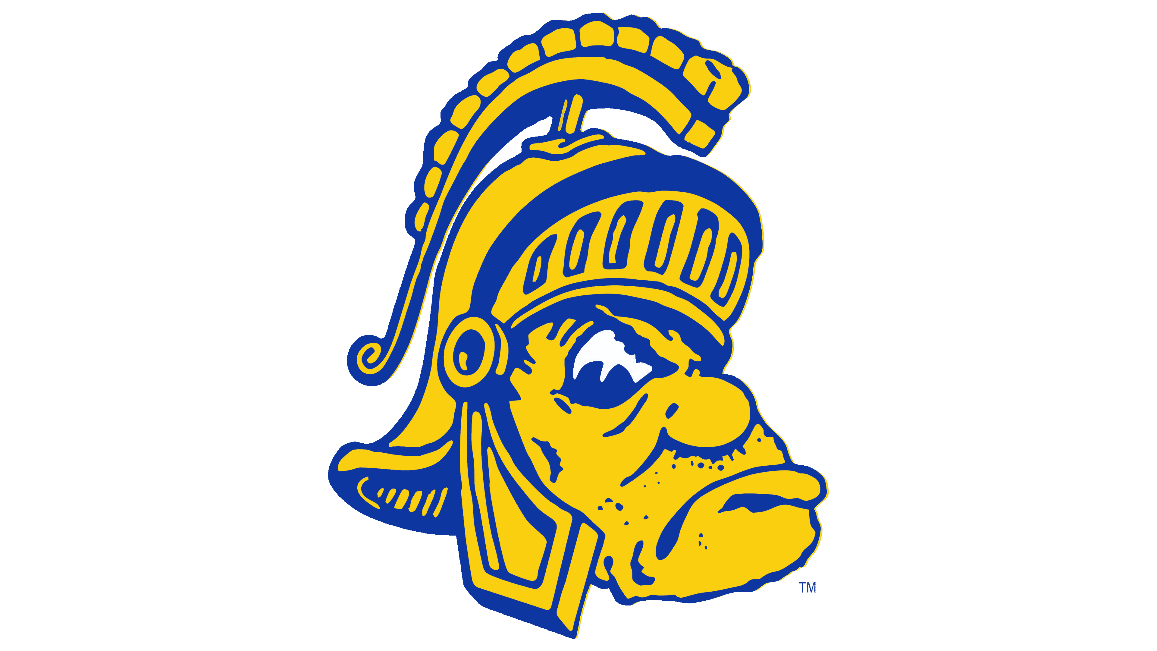
The San José State Spartans logo from 1948–1949 features a Spartan profile in a harsher, simpler style. The face is drawn with rough strokes emphasizing the large nose, deep facial folds, heavy chin, and frowning eyebrows. The image remains somewhat caricatured but conveys a combative attitude.
A Spartan helmet with a wide, segmented crest sits on the character’s head, highlighting ancient symbolism and warrior attributes.
The color palette consists of yellow and deep blue. The figure is primarily rendered in yellow, with blue outlines shaping the form. Despite the exaggerated drawing, the image balances irony with respect for the Spartan spirit.
1949 – 1960
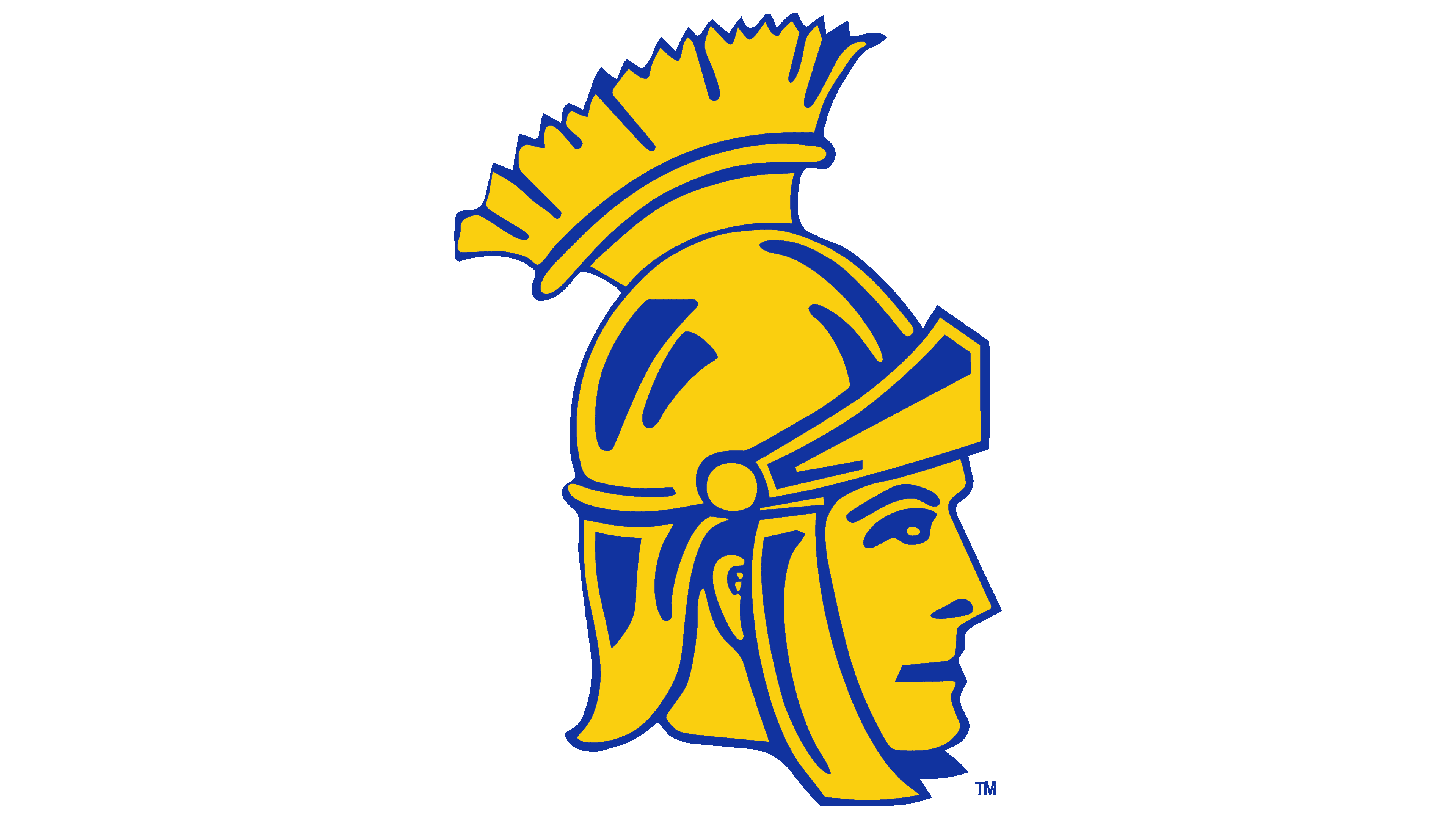
The updated San José State Spartans logo moved away from cartoon versions and adopted a more serious, refined style. The profile of the Spartan warrior is drawn with concise lines. The character’s face appears calm and balanced, with proper proportions, giving the image a noble and dignified look.
The composition focuses on the Spartan helmet, with a large crest made of repeating elements. The color scheme keeps a rich yellow as the figure’s main tone, with dark blue outlines and details.
In the new version, the humorous tone of earlier designs is replaced with a reserved simplicity that reflects respect for the university’s historical heritage and its athletic teams.
1960 – 1977
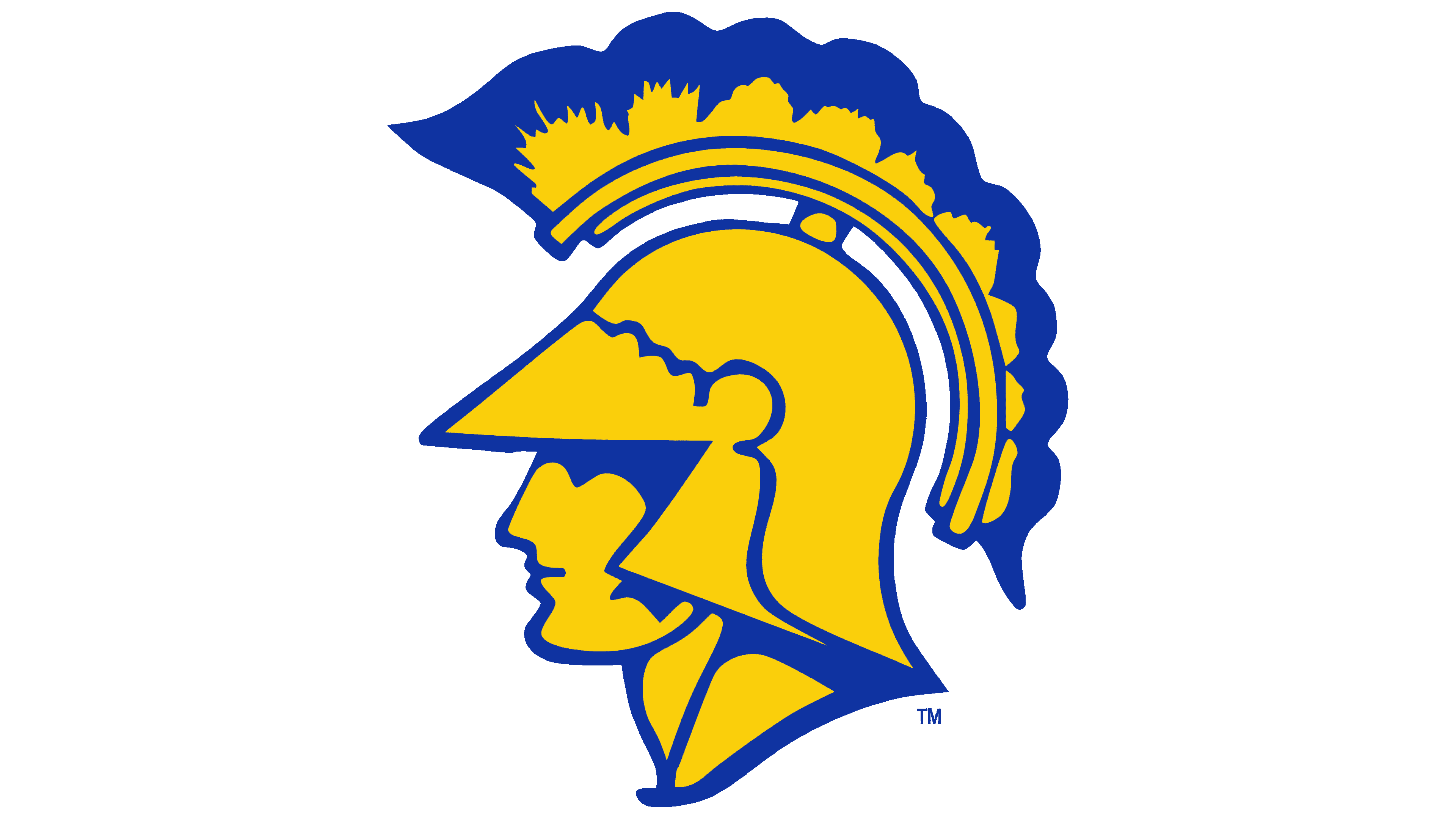
In the San Jose State Spartans logo from 1960, the Spartans’ profile is depicted with a limited set of simple lines, emphasizing calmness and the strength of the ancient image. The facial details are simplified, leaving only the necessary strokes to convey the figure’s noble character.
The main focus remains on the massive Spartan helmet with a visor and a wide crest decorated with neat patterns and smooth curves.
1977 – 1981
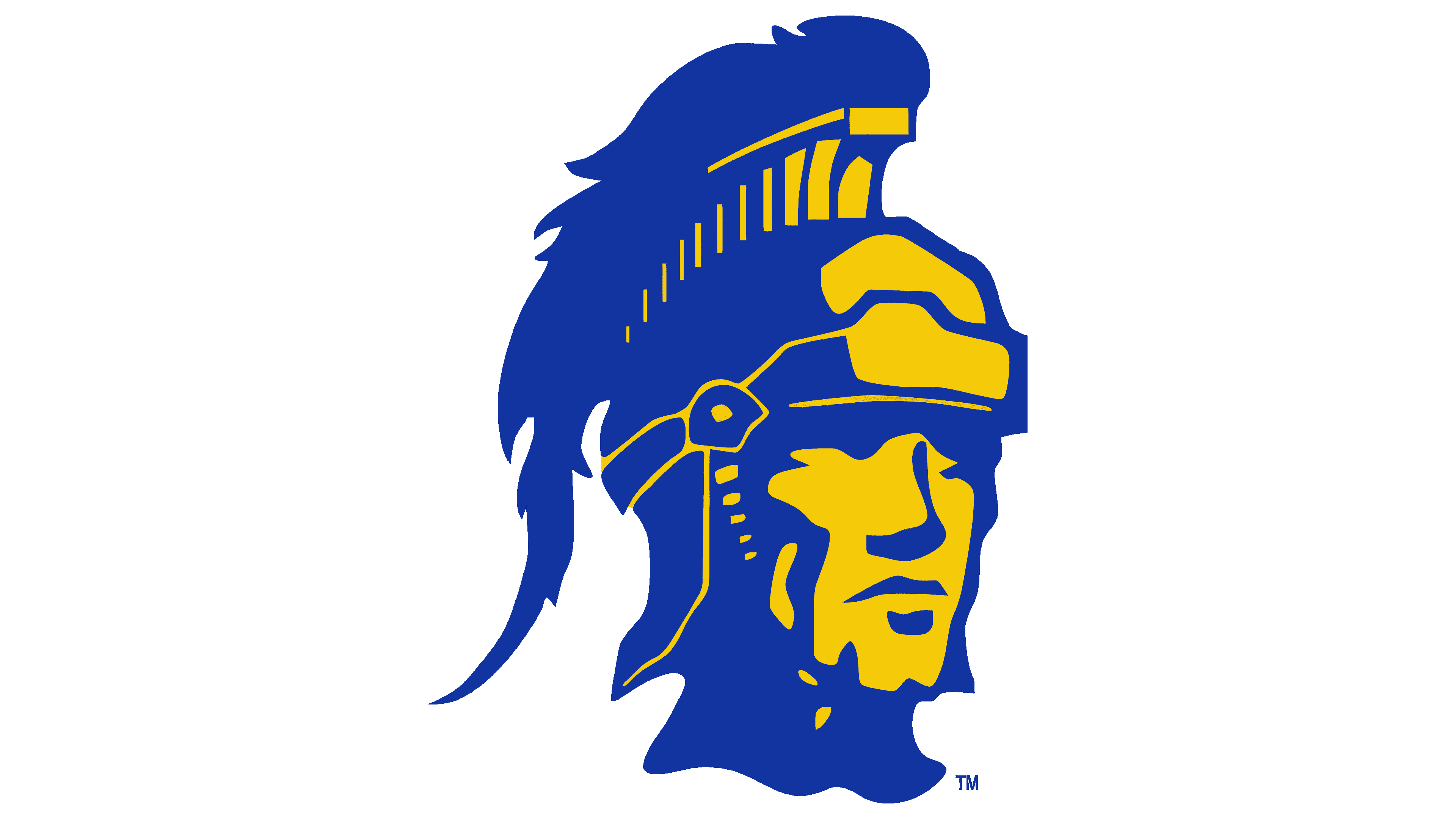
The next version of the logo emphasizes the grandeur and heroism of the ancient warrior. The Spartan’s profile is shown wearing a massive, richly decorated helmet. The helmet features a high crest, complemented by decorative elements and feathers, which create a sense of solemnity.
The facial features highlight the chin, cheekbones, and nose. The face is serious, expressing concentration and inner strength, departing from the conventionality of previous logo versions.
Dark blue dominates, filling both the figure and the background. Yellow highlights the face and certain helmet details.
1981 – 1983
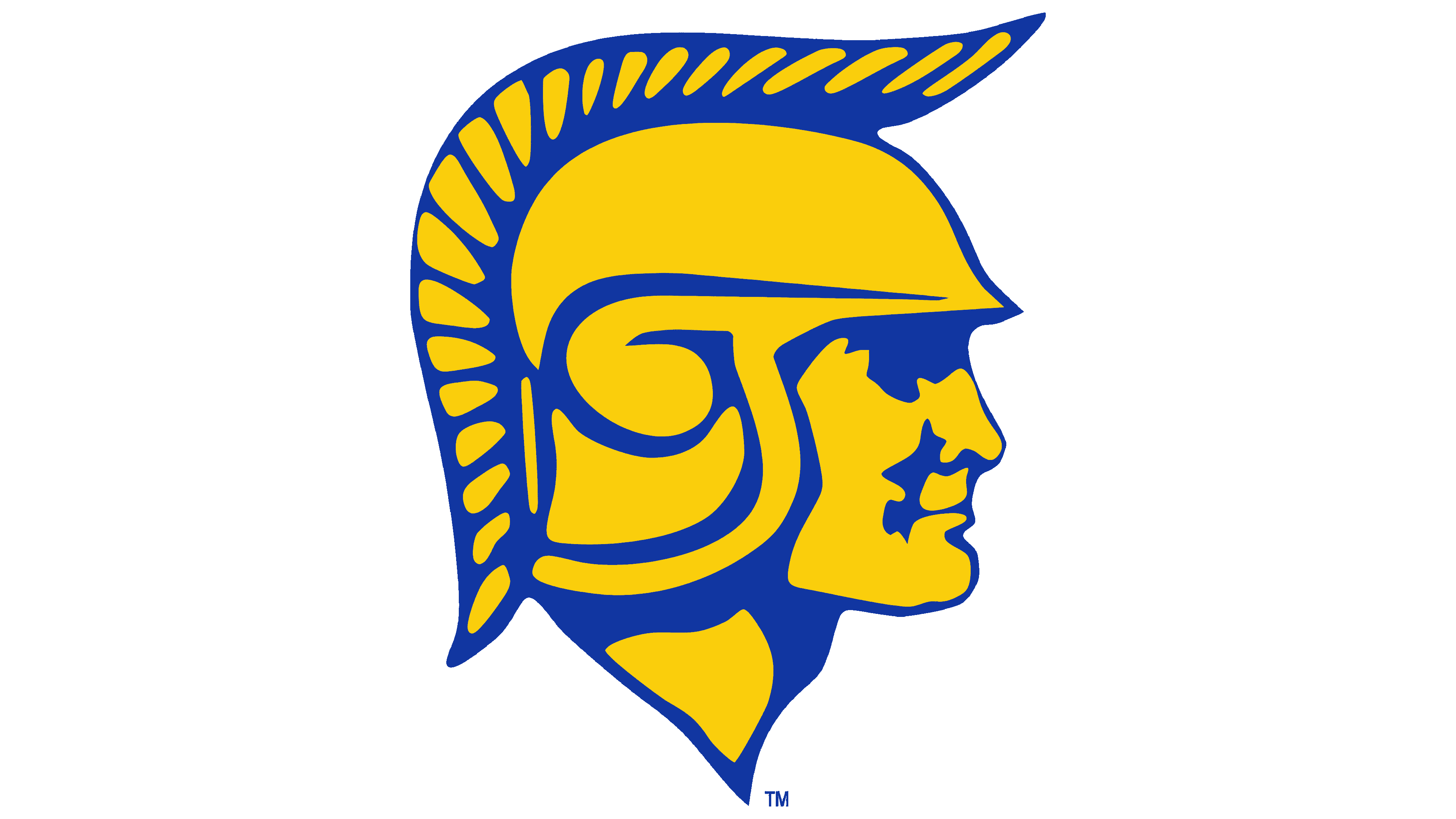
The San Jose State Spartans logo features an ancient warrior in a different decorative style. The Spartan’s profile faces right, with facial lines reduced to minimal strokes defining the nose, lips, chin, and cheekbones.
The key element is the helmet, with a large crest composed of identical, rounded, drop-shaped segments. The helmet’s interior is filled with elegant curls and smooth lines.
1983 – 1985
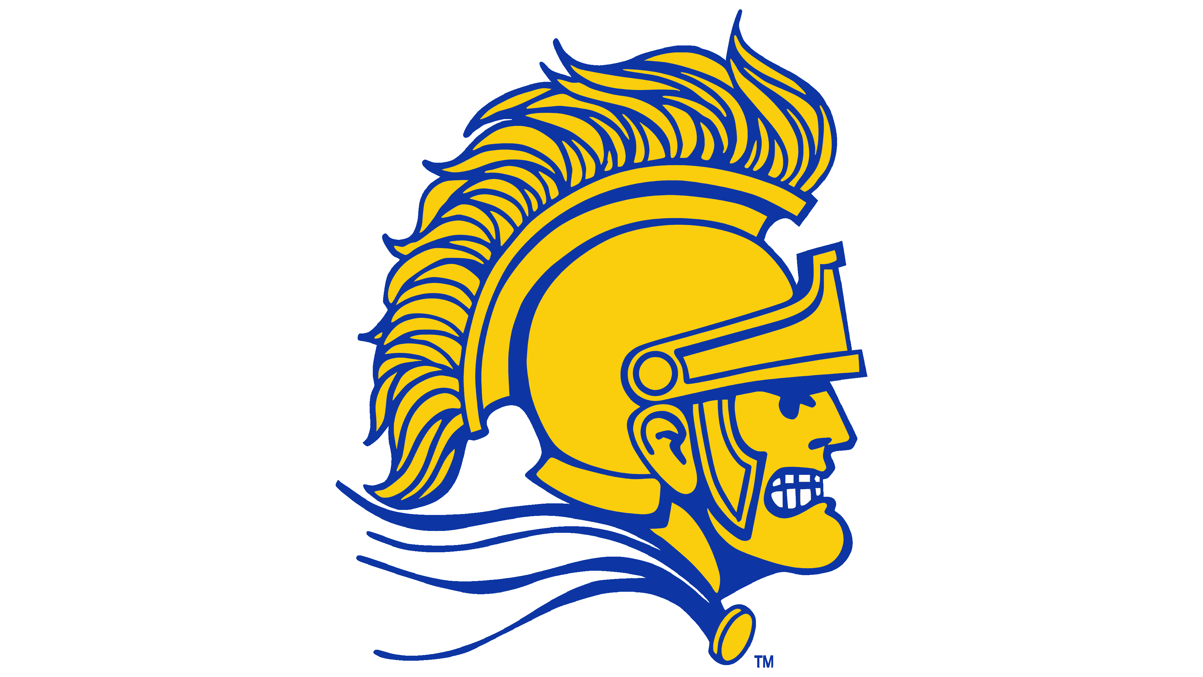
The 1983 logo stands out for its emotional presentation. The Spartan’s profile, with a helmet and crest, faces right. For the first time, a flowing cloak appears, enhancing the sense of action.
The warrior’s facial features convey battle. The gaze is tense and directed forward, the eyebrows are drawn together, and the teeth are bared in a grimace. The helmet crest consists of repeating wavy elements resembling feathers, reinforcing the image’s sense of motion and liveliness. The color scheme remains the same. The drawing style once again slightly resembles comic book illustrations.
1985 – 1999

Starting in 1985, the teams used a logo in which the Spartan figure became completely abstract. It is a profile of an ancient helmet facing left. In this version, it removes all facial details. Instead, a smooth metal plate with a small eye opening creates a depersonalized warrior image.
The helmet’s crest is composed of evenly spaced rectangular segments arranged along an arc, resembling stylized plumage. A visor was added, covering the lower part of the helmet and enhancing the minimalistic appearance.
The color scheme was reduced for the first time to a single rich shade of blue. The helmet is presented as a universal ancient symbol representing team spirit and shared university ideals.
1999 – 2010
The new San Jose State Spartans emblem introduced, for the first time, a Spartan warrior with a spear. The image conveys an active pose of the character threatening with the spear. The drawn muscles emphasize the action’s tension.
The warrior wears a Spartan helmet with a high decorative crest, with the face hidden, focusing on the extended arm and forward-pointed spear. The emblem features bright yellow, dark blue, and light blue colors.
At the bottom, the name “San Jose State” is written in a sharp-edged font, stylized to fit the ancient theme and create a three-dimensional effect. The inscription is split into two lines, with “State” smaller and placed below the main title. The text is set on a blue background.
2010 – 2018
Designer Nick Adkins created the San Jose State Spartans logo by combining two previously separate symbols: the Spartan Helmet and the University Spirit Mark. The university team developed the design with support from the University Advancement department. The official font “SJSU Pride AP” was introduced for accompanying text, though the main logo image contains no inscriptions.
The main element of the composition is the Spartan helmet in profile, facing left, rendered in a geometric style with minimal detailing. The face is not visible, concealed behind a solid visor with only a narrow eye slit.
Special attention is given to the crest, formed by sharp triangles. Varied shades create a visual effect of depth. The helmet’s blue outline enhances contrast with the yellow interior.
The university colors, blue and yellow, remain unchanged, but the added shadows and smooth gradients make the composition more modern and richer in tone.
2018 – today
The next version of the San Jose State Spartans logo was simpler and more concise than the previous one. It retains the familiar profile of the Spartan helmet, facing left, but simplifies some design details.
Changes affected the helmet crest, removing the light blue shades and gradients. It now appears as flat, uniform yellow segments. The double-tone effect inside the helmet was eliminated. Instead, it has a consistent, even color. The bright blue outline remains and stays part of the composition.