![]() Miami (Ohio) Redhawks Logo PNG
Miami (Ohio) Redhawks Logo PNG
The Miami (Ohio) Redhawks logo creates a recognizable visual identity, showing the connection between the sports team and the university it represents. It also symbolizes energy, passion, perseverance, and strength, qualities needed for victory in competitions.
Miami University athletics began in 1888, when the football program was created on the campus in Oxford, Ohio. The university itself had been founded in 1809, making it one of the older public universities in the United States. In the early years, its teams used informal names such as Reds and Whites, Big Reds, and Miami Boys, as was common in college sports before official team identities became fixed.
In 1931, the university adopted Redskins as the shared nickname for its athletic teams. The name remained in use for 65 years, spanning many stages of the program’s growth. During this period, Miami built a broader athletic identity, while its hockey program became one of the school’s most visible sports, competing with strong programs such as the University of Michigan and Ohio University.
Miami also became known as the “Cradle of Coaches” because many major football coaches studied or began their careers in Oxford. The list included Weeb Ewbank, Paul Brown, founder and first coach of the Cleveland Browns, and Ara Parseghian, later associated with Notre Dame. This coaching legacy became one of the main historical markers of the university’s athletic program.
In the 1990s, debate grew over Native American names in sports. After discussions with Native representatives, including the Miami tribe, the university changed its nickname. In 1997, the teams became the RedHawks, with new logos and a revised visual identity. In the 2000s, Miami competed in the Mid-American Conference, where rivalries with Ohio University and Bowling Green shaped regular competition. The football team had bowl appearances during stronger seasons, while hockey continued to reach the NCAA tournament.
Meaning and History
![]()
Until 1997, the Miami Redhawks were known as Redskins and used logos featuring images of Native Americans. They were named in honor of the indigenous people who lived on the territory that is now the state of Ohio and were forced to leave their lands in 1795, when the Treaty of Greenville was signed. Fourteen years later, Miami University was built on that spot.
In 1928, advertising director P.J. McGinnis decided to emphasize the university’s connection to the Native American tribe by naming its teams the “Big Red-Skinned Warriors.” This nickname was mentioned in the school newspaper. In 1931, the name Redskins became attached to the athletes, first appearing in the annual Recensio. Around the same time, a logo featuring the head of a Native American began to be used first on the cheerleaders’ uniforms and then around the campus. The elders of the Miami tribe maintained close relations with the university and did not object to its symbols. The Chiefs even helped create authentic Native American attributes for the sports mascot.
The emblem’s design changed several times until the most famous version appeared: a realistic Native American head next to the letter ‘M.’ This happened against the backdrop of active attempts by the National Congress of American Indians to prohibit educational institutions from using identities with stereotypical images of Native Americans. Nonetheless, the Miami tribe approved several directives approving the name and logo of Miami University’s teams (in 1972 and 1991). The chiefs changed their minds only in 1996. They called for the abandonment of the offensive nickname Redskins but allowed the logo with the Native American head to remain, considering it “respectful and dignified.”
The Board of Trustees decided to rename the teams, despite the indignation of many alumni and sponsors. The name “Miami Tribe” was initially considered, but the final choice was “Redhawks”. Since then, the sports logos have contained the image of a bird of prey. In 2012, a symbol in the form of an ‘M’ appeared, referencing the team’s historical heritage.
What is Miami (Ohio) Redhawks?
The Miami (Ohio) RedHawks are a team from Miami University, which was named after the Miami tribe of Native Americans in Ohio. They participate in NCAA Division I and are almost all members of the Mid-American Conference. The hockey players compete in the NCHC, and the football players in the FBS.
1956 – 1973
![]()
The logo features a silhouette of a person performing a ritual dance. He freezes in an unusual pose, kneeling on one leg, his head bowed, and his hands folded behind his back. The artists portrayed him as a large, dark red spot. Still, they supplemented the drawing with elements that make it clear he is a North American Indian, including a tomahawk and a feathered headdress.
1973 – 1983
![]()
The appearance of the dancing Indian changed. Now he stands, lifting one leg and swinging his arms, weapons in hand. The red silhouette has acquired white details, making it easier to recognize the outlines of muscles, clothing, and shoes.
1983 – 1997
![]()
The logo featuring a black-and-white head of an Indian is a stylized version of a portrait by the artist John Ruthven, commissioned by the university. The original painting was created after consultation with the Miami tribe and was inspired by the appearance of Chief Little Turtle from the Wea branch. He is depicted with long dark hair, two feathers, and a choker. On the sports team’s emblem, the head is topped by a large red letter “M” with rectangular serifs.
1997 – 2010
![]()
In 1997, the Redskins were renamed to Redhawks. A specially created committee collaborated with a consulting firm with extensive experience developing logos for universities and sports brands. It was originally planned to preserve elements from the previous emblem, but the final version is fundamentally different.
The central image is a red hawk with a white chest. He sits, spreading his wings wide and clutching a black ribbon with the inscription “RedHawks.” In the background is a brick arch shaped like an inverted “U.” Its peak is adorned with the large white word “MIAMI” and the small “UNIVERSITY.”
2010 – 2012
![]()
After refining the logo, the team’s name was shifted down. It is divided into two lines, centered. The first word is typed in large white letters with triangular serifs, and the second is in black italic glyphs with an individual design. Above is a picture of a hawk’s head, which is looking menacingly to the left.
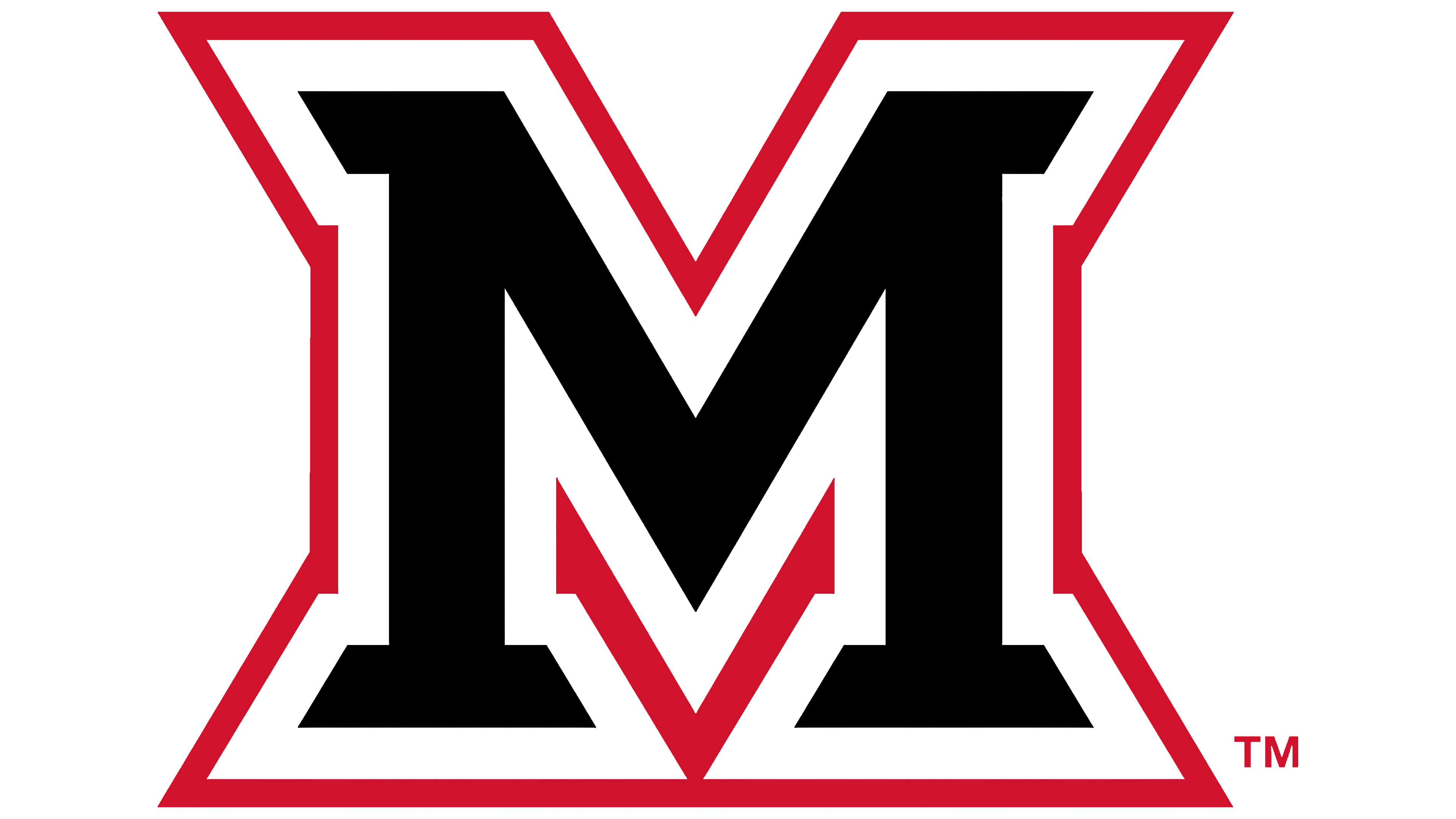
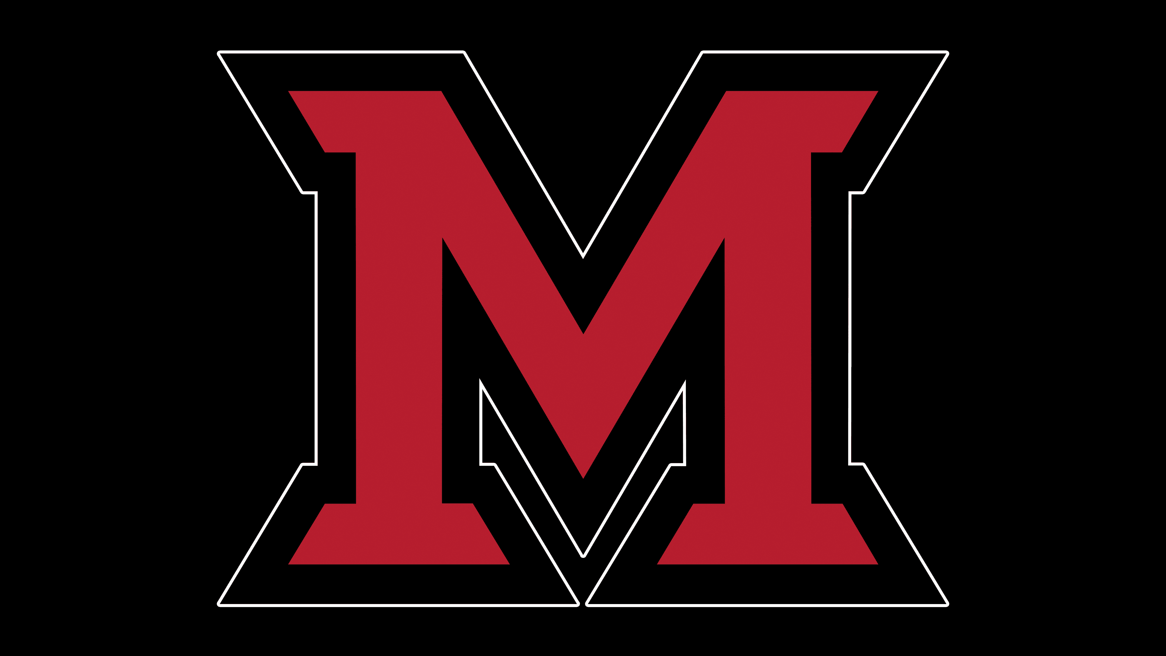
2012 – today
![]()
In 2012, the Miami (Ohio) RedHawks introduced an emblem in the form of a large red letter “M,” outlined in black. Its angular shape with sharp serifs symbolizes dynamism, energy, and determination. This reflects the bold playing style of sports teams.
Font and Colors
The “M” in the logo has a unique design. It was created using lettering specifically for the Redhawks. The developers made it bold and decorated it with trapezoidal serifs.
The team’s official colors are white and red. They were once used by two literary organizations of the university, founded in 1825: the Union Society and the Erodelphian Society. Nevertheless, on the logo, red is combined not with white but with black.