Sanctuary, an ambitious project aimed at preserving human knowledge through an innovative time capsule, is set to land on the lunar surface within this decade. The capsule, designed to last for millions of years, will carry ultra-hard sapphire discs engraved with a vast array of information from the arts and sciences, encapsulating the essence of human achievement and knowledge. As part of this groundbreaking mission, Sanctuary has introduced a new logo, symbolizing its commitment to safeguarding humanity’s legacy for future generations.
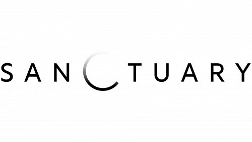
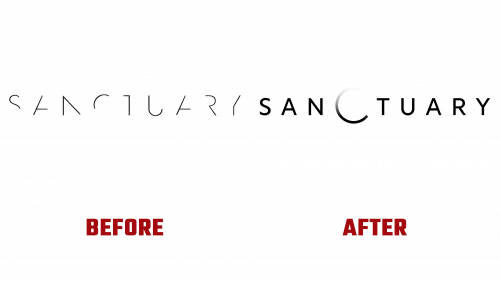
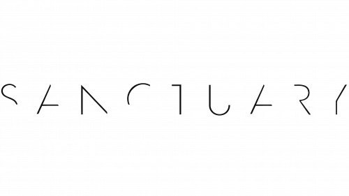
The Sanctuary logo has been reimagined to reflect better the project’s monumental goal of transmitting our heritage through the cosmos. Moving away from the previous design, which embraced a more abstract and enigmatic aesthetic, the new logo adopts a clearer, more direct typographic approach. A notable feature of this redesign is transforming the letter “C” into a larger, more rounded shape, representing a celestial body – either Earth or its moon. This design choice aims to visually communicate the project’s extraterrestrial destination and broader philosophical and anthropological objectives.
Despite intentions to depict a lunar eclipse within the logo, the execution presents a subtle gradient that may not immediately convey the intended effect to all viewers. This choice has sparked discussion about the challenges of symbolizing such a specific astronomical event within the constraints of logo design. Nonetheless, the overall composition successfully captures a sense of outer space and maintains versatility across various color schemes, enhancing its visual impact.
The new logo incorporates a spinning device, a creative element that, while evoking a sense of ongoing activity or “loading,” aims to forge a connection between the logo and the broader messaging of the Sanctuary project. This design decision, however, has been met with mixed reactions, as it could be associated with digital waiting cues, potentially diluting the logo’s symbolic power.
As Sanctuary prepares for the historic launch of its lunar time capsule, the new logo stands as a beacon of human aspiration and ingenuity.


