The Grupo Santander logo represents the bank as a reliable platform for collaboration between Latin America and Spain. The elements show how active financial exchanges take place on an honest, legal basis through this institution.
Santander: Brand overview
| Founded: | 1857 |
| Headquarters: | Santander, Spain |
| Website: | santander.com |
Meaning and History
Behind the modern appearance of the banking group lies a multitude of rebrandings. It has changed several names and logos before transforming into Santander, which is now known as the largest bank in Spain.
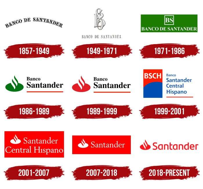
The first emblem (1857-1949) consisted of a semi-circular inscription “Banco de Santander,” the second (1949-1971) featured a monogram of the letters “BS,” and the third (1971-1986) replaced it with the acronym “BS” in a square.
After that, the financial and credit company was renamed Banco Santander. This was reflected in its trademark: the 1986-1989 version contained the phrase “Banco Santander” (right) and a flat oval with a stylized blue flame (left). In 1989-1999, the graphics were red.
As the third-largest Spanish bank, Banco Central Hispano is part of Grupo Santander; its logos are also considered part of Santander’s historical past. When the bank was named Banco Central, there were at least five of them. Banco Hispano Americano had three.
Banco Central Hispano itself had only one emblem left after their merger, with the inscription “Central Hispano” – a blue square and a yellow spiral figure. It was used from 1991 to 1999. Then, the bank merged with Banco Santander and founded Banco Santander Central Hispano.
The newly formed group had two logos, and the second one (2001-2007) laid the foundation for the modern trademark. It contained a white inscription, “Santander Central Hispano,” and a circle with a fiery swirl inside a red rectangle.
After the name change in 2007, Santander removed the words “Central Hispano” from the emblem, leaving everything else unchanged. The next redesign happened in 2018: the organization changed the font, made the background white, and presented the main elements in red.
What is Santander?
There are at least two companies with this name: the financial and credit institution group Grupo Santander and its structure, Banco Santander. The main organization is based in Spain but is represented far beyond this country, primarily in the USA, Latin America, and the United Kingdom. The company’s history dates back to 1857.
1857 – 1949
The history of the emblems of this financial institution is the evolution of the text, as there are few graphic elements. The debut version uses the inscription “Banco de Santander,” made in Old English letters, where each symbol resembles a work of calligraphic art. Their design includes swirls, fork-like legs, bends, and large and small dots. The inscription is arranged in an arc shape.
1949 – 1971
After many years of using the first logo, the bank introduced a new corporate sign. It consists of a monogram including the intertwined abbreviation “BS.” The letters are white with a thin black outline. They retained the Old English style, unlike the full inscription below. In this variant, the phrase “Banco de Santander” is typed in high, thin letters with thin serifs.
1971 – 1986
Graphics and color were added to the logo. The letters “BS” are enclosed in a square frame. The full name of the bank is located below and written in a print font in uppercase, where thick lines harmoniously combine with thin ones. Serifs are preserved. All elements are in a bright green rectangle. This color contrasts well with white and symbolizes money.
1986 – 1989
In 1986, the elements were rearranged. The developers removed the particle “de” from the name and arranged the words in two lines: “Banco” in small font at the top and “Santander” in large font at the bottom. The symbols are translated into lowercase, except for the first letters. The bank’s name is underlined with a bold red line. On the left appeared a graphic figure, representing a green oval with curved stripes rising upwards. It has the shape of a pointed drop.
1989 – 1999
Changes in these years affected only the color. All green designers repainted in red.
1999 – 2001
Rebranding and experiments with identity led to the appearance of a vertical rectangle with a new name, ungrouped into four lines. The top word, “Banco,” is in small font; the other three lines, “Santander,” “Central,” and “Hispano,” are in lowercase (except the first). Below them is a red underline. On the left is a red-blue rectangle with the abbreviation “BSCH,” typed in the same font as the rest of the text.
2001 – 2007
The financial institution’s management decided to return to the old drop-shaped badge on an oval. The word “Santander” is written next to the brand name below – “Central Hispano.” All elements are in white and placed in a red rectangle, now in a horizontal position. The font is thin, with serifs.
2007 – 2018
In 2007, the designers proposed a lighter version of the old emblem. They retained the red rectangle but narrowed it, removing the bottom part of the name. As a result, a logo remained with a thin imprint, “Santander,” and a corporate symbol to the left of it.
2018 – today
The developers made the logo negative, like a film. They changed the colors: everything that was red became white and vice versa. Therefore, the background and oval are now white, and the inscription is raspberry. They also worked on the font: removed the serifs and added width, evenness, and smoothness to the letters. The letter “t” was cut in half (on the left side), and the letter “a” was shortened in the tail and top part.
Santander: Interesting Facts
Santander is a big bank that started in Spain in 1857. It’s named after the city where it began. Now, it’s one of the biggest banks in the world.
- Started in Spain: Santander was made to help with trade between Santander port and Latin America.
- Grew All Over: It expanded to other countries in Europe, Latin America, North America, and Asia.
- Buying Other Banks: Santander grew by buying other banks, such as Abbey National in the UK, Banco Real in Brazil, and Sovereign Bank in the USA.
- New Tech for Banking: They use new tech like blockchain to make banking faster and safer.
- Helps With Education: Santander works with universities to give scholarships, internships, and help for starting businesses.
- Cares About the Planet: The bank wants not to harm the planet and works on projects that help the environment.
- Education Program: They believe education can make the world better. They have a program called Santander Universidades that helps students and schools worldwide.
- Likes Racing: Santander has helped sponsor Formula One racing teams and races, which helps them be known worldwide.
- Online Banking: They’ve made banking easier with online services and apps and even have a digital-only bank called Openbank.
- Supports Art and Culture: They help with art shows and cultural events, showing they care about more than just banking.
Santander has grown from a small Spanish bank to a big global bank. It keeps up with new technology and cares about education, the environment, and culture.
Font and Colors
Since 2007, the logo of the financial and credit group has been a combination of the name and a stylized fiery swirl. The graphic part is an oval with wavy lines extending beyond its limits. Initially, the background was a red rectangle, but in 2018, the designers removed the geometric figure, considering it superfluous.
The emblem reflects Santander’s main values: strength, leadership, and internationality. The flame is used as a sign of dynamism and triumph. Also, in its shape, it resembles an “S” – the initial letter of the name of the banking organization.
The font used in the 2007-2018 logo has a lot in common with Berstrom DT Bold. Since 2018, a rounded semi-bold font without serifs has been used – the complete opposite of the previous version.
The color palette includes red and white colors, with red dominating. It symbolizes decisiveness, energy, and strength.
Santander color codes
| Pigment Red | Hex color: | #ea1d25 |
|---|---|---|
| RGB: | 234 29 37 | |
| CMYK: | 0 88 84 8 | |
| Pantone: | PMS Bright Red C |
FAQ
What does the Santander logo mean?
The most iconic element of the Santander logo is a geometric oval with wavy lines emanating from it. Officially, it is called the Santander Flame. It is an abstract image of evolution – humanity as a whole and the financial and credit group separately. It reminds us of the organization’s origins.
What font is used in the Santander logo?
For the Santander wordmark, a font of the same name developed by Monotype specialists is used. It is the basis of the typographic style of the entire banking group. Smooth lines, curves, and minimalism characterize it. It has become more flexible to adapt to digital devices easily.

