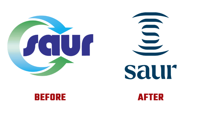
One of the organizers and participants of the Mission Water movement, Saur, has unveiled its new identity, the update of which is the result of a review of its strategy. The brand sees its main task as ensuring effective protection of water resources, their quality purification, and the organization of equitable water distribution. At the same time, the company strives to cover citizens and municipalities, farmers’ enterprises, NGOs, and the entire society with its services. At the same time, it tries to involve as many people and organizations as possible to save and clean water, invests in saving this important resource for the whole planet, invents new models, and finds solutions to existing problems. The new brand identity effectively reflected the changes in strategy and the goal to become a major leader in the water transition by 2030.
The visualization of the brand was not based on a minimalist principle. The entire brand identity was formed with a minimal load of both visual elements and excessively detailed text information. The new logo consists of a symbolic image of waves spreading on the surface of the water and a text sign – the name of the brand, located directly under this symbol. The image itself has hidden information about its affiliation in the form of the letter S – the first letter of the name, which is formed by three central segments.
The corporate identity designed the text element of the logo and as the main element emphasizing the area of the company’s professional activities. Executed without serifs, with alloyed curves characteristic of fluid media flowing over various surfaces, it creates a sense of fluidity. Breaks in the elements of the letters, their discontinuity in the points traditionally joined relate the observer to the effect of the surface tension of the liquid and discontinuity of its droplet with a rounded shape of each of the droplets.
The choice of one signature color – deep blue, symbolizing pure water at the depths of a natural spring – was also made to reduce visual elements and to reflect the main important information about the company’s area of operation. This color is a symbol of coolness and freshness, demonstrating a direct connection between the brand and water and characterizing its owner as a respectable and solid company. At the same time, its deep and saturated hue, made using the achievements of modern technologies and applied in the brand identity, provides a high quality of its perception when reflected by typographic or modern digital methods.


