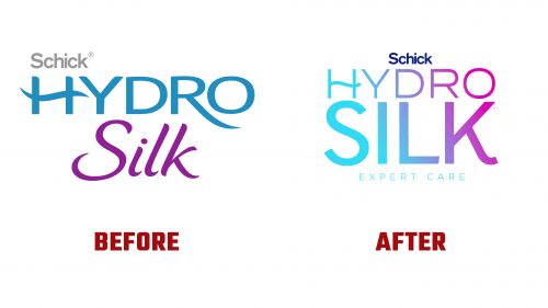
Schick Hydro Silk has introduced a new logo and packaging designed by JDO. This change aims to elevate the brand’s identity and align it with its promise of expert care and high performance in hair removal. The new design focuses on sophisticated elements and a modern look to enhance the brand’s presence in the market.
The new logo features a sleek, streamlined design emphasizing precision and expertise. It includes a gradient transitioning from deep blue to lighter shades, symbolizing the brand’s association with hydration and care. This gradient effect adds a vibrant, modern touch, making the logo stand out, especially on product packaging.
Dark blue has been chosen as the master brand color, reinforcing a premium, professional feel. This color connects to the brand’s roots in hydration and enhances its visual appeal. The gradient within the logo further highlights this professional look, making it eye-catching and memorable.
A new, sleek typeface complements the logo’s modern aesthetic. This clean and sophisticated typeface reflects the brand’s superior expertise in hair removal. The words “Expert Care” are now included under the logo on all touchpoints, reinforcing the brand’s commitment to professional-quality results at home.
The logo design incorporates subtle details that add to its overall appeal. The lines and angles convey precision and performance, which are essential qualities of the Hydro Silk brand. The logo’s form is elegant and dynamic, capturing the essence of the brand’s promise to provide high-level care and effectiveness in hair removal.
The packaging has been redesigned to match the new logo and brand identity. The dark blue gradient is used on the packaging, creating a cohesive look that stands out on shelves. The design is minimalist yet impactful, ensuring that the products are prominently showcased. This approach highlights the quality and performance of Hydro Silk products, making them more appealing to consumers seeking professional-grade hair removal solutions.
The updated typeface is used consistently across all product lines, reinforcing the brand’s message of expertise and care. The packaging is designed to be user-friendly, with clear labeling and instructions, ensuring that consumers can easily find and use the products that best meet their needs.
The new branding balances heritage and modernity. The contemporary and vibrant design elements pay homage to the brand’s established history in self-care. This balance ensures that the new branding feels fresh and innovative while rooted in the brand’s long-standing reputation for quality and care.


