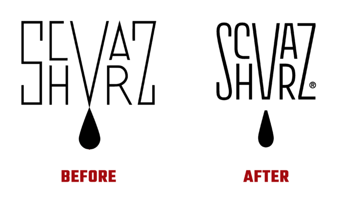
Fans of delicious roasted coffee are well aware of the products of the Schvarz Kaffee plant from Teil Flingerns, Düsseldorf, Germany. Founded in 2015 by Arthur Fuchs and Erkan Karakaya, the brand is the realization of a long-standing desire of the latter to bring their micro-roasted coffee recipe to life. The special feature of this product is the careful selection of grain, which is purchased from small farms or associations of small farmers. Thus, the formation of a unique taste and high quality in Schvarz coffee is ensured. At the same time, the company’s desire to support small economic structures that care about the quality of their grains and protect the environment is manifested. The coffee offered is grown in strict compliance with the principles of sustainable development and sold on a fair basis at prices that reflect the product’s true value. To attract the attention of potential consumers of a unique coffee to expand its participation in the global market, the brand has rebranded using modern digital technologies.
The new visualization demonstrated commitment to what previously ensured the successful development of the brand. Clean but fun branding was developed, with special attention to detail. The visualization system was built with existing, time-tested elements with a distinctive design using the standard contrasting colors of black and white. In the new version, additional shades were added, which increased the effectiveness of the impact of visual identity on the consumer. This addition made the products more attractive and distinguishable from competitors on the supermarket shelves. They provide an environmentally friendly and attractive alternative to the consumer. An important point in the formation of the new style was preserving the historical essence of the logo, providing it with a more balanced and smoothed version.
When shaping the appearance of the packaging, an optimal balance was chosen between a clean and informative design, in which a place was found for funny illustrations, and patterns that effectively demonstrate the brand’s love and knowledge of coffee. Graphics and illustrations, upon close examination, reveal to the viewer all the depth and features of visualization in a mixture of funny characters, the image of very specific coffee machines, and various objects used in preparing a delicious drink. For small packaging elements, a material was chosen that is completely recyclable. To distinguish between different coffee versions, colorful labels and a dash of a sticker were used, easy to change even at the time of sale.


