During a pandemic, it is especially important to remind customers of your company and services.
Schweitzer Mountain Resort is a mountain resort located in Idaho. Previously, the brand developed a development and expansion plan, but with quarantine and all restrictions, work had to be suspended. Despite this, the company decided to update its identity before returning to normal operation.
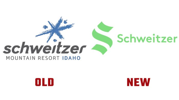
The Schweitzer Mountain Resort website is still using the old snowflake logo and full name, but the blog already has information about the brand’s new design. The first change concerns the name of the company. According to representatives, customers in their daily life refer to the resort as Schweitzer. The management decided to listen to consumers and reduced the name to one word.
The new symbol of the company is the laconic green letter “S.” In line with the best trends of 2021; the designers stylized the letter using three lines aligned at a 45-degree angle. The three stripes represent the resort’s main attractions: 6,400 feet, Pend Oreille, and The Terrain.
Designers looked to the brand’s history and drew inspiration from the 1963 logo. At the time, the company name used a beautiful serif and line font. Also, the company decided not to be limited only to green but added yellow and orange shades. The main color is associated with nature, the environment – what the brand symbolizes. Additional shades symbolize the color of skiers’ clothing and the spirit of the founders – energy and brightness.
Not all social media users were happy with the new changes. Some of them noticed that the Schweitzer logo strongly resembles the Seattle Kraken National Hockey League image. In turn, the company’s management said that work on the visual identity is still ongoing, but the main logo will not be changed. The brand argued its decision because some people are not always ready for changes, and the new logo perfectly reflects the connection of all elements of the company. Schweitzer added that their past snowflake logo generated the same controversy, but over time it became familiar to many.


