The redesign is not an exceptional phenomenon in fashion brands, but it is not frequent either. As they say, everything is relative. Regarding the time of brand creation, the economy, geography, and population conditions create the company’s target audience. The fact is that, like any other brand that is engaged in the production of certain products, sometimes you want to refresh your assortment with something new and alluring, and a clothing manufacturer knew from the last century sometimes gets tired of its conceptual design and wants to change everything, up to store building facade.
This situation affected the well-known Dutch manufacturer Scotch & Soda. The company decided to update the visual design, expand and create a new atmosphere in boutiques, adding colors and meanings to the premises where products are sold.
The first sketches for the rebranding were created last year in the spring. Like many companies, spring for Scotch & Soda turned out to be a time of transformations and discoveries. And if you also connect with the fact that a pandemic has come around the globe due to the coronavirus, then, of course, delirium wanted to breathe new life into the old brand.
And so, new stores began to appear for the existing 200 enterprises; the new logo began to work to attract attention. A new line of women’s, men’s, and children’s clothing is already emerging; sunglasses, perfumes, and other interesting accessories that are in great demand nowadays are on sale.
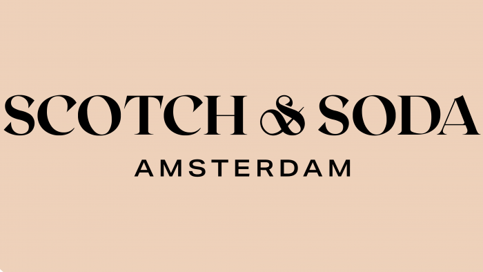
As for the logo, it is more ornate than the previous one. Serif font with a curl in the “&” sign was especially used to show the aristocracy and fashion of the brand. Oh, such a font should not be confused with medieval records. He is very modern but wayward and self-sufficient, even proud, and to some extent seems arrogant. Most likely, it’s the serifs. They make this authoritative label pretentious and authoritarian as if declaring that no one is worthy of standing next to it.
It only seems that the brand repels customers with its grandeur and deliberate aristocracy. On the contrary, ask and interest in the label began to increase; moreover, new product collections arrived, sales horizons expanded, which indicates the success of the rebranding and the correct direction of creativity.


