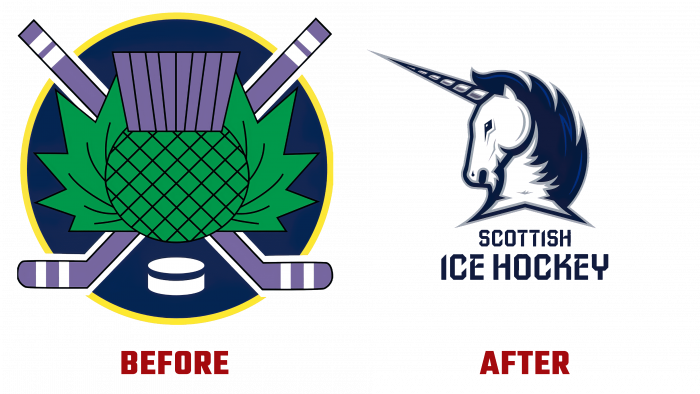
The Scottish National Government has come up with an ambitious ice hockey brand identity. Thus, popularizing this sport in the region and strengthening the national spirit is a single conceptual mission.
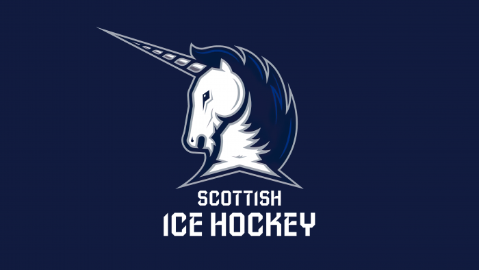
The famous symbol of Scotland was chosen to launch the creative logo – a dynamic, bright, strong unicorn. This image is very close to the Scots and has always been respected. In ancient memorials, they still find the stylization of the image of the unicorn as a magical and indestructible creature, which the ancestors of the Scots believed. This is a cult image associated with invisible forces, energy, sung in legends and epics.
Each of the elements in the unicorn image represents a specific aspect related to ice hockey. For example, a horn has six segments. These are six ice warrior defenders. Colors – white and dark blue, gray edging around the image – hints at traditional national colors. The pose of a unicorn with a horn protruding forward, the creature’s face turned to the left as if poetically indicates the animal power and strength of the character of the symbol. At the base of the neck of the unicorn, another national image is hidden – the cross of St. Andrew the First-Called. True, it is not so noticeable due to the stylization of the fur and the unicorn’s head. Still, an attentive viewer, originally from those lands, will note the dedication to tradition.
The descriptor for Scottish Ice Hockey is rendered in a serif font, adding magic and dynamism to the image. This font is visually sharp, bold, pretentious. It fully illustrates the skills necessary for sports – strength, endurance, speed.
This logo is appropriate for the release of products among cubes, trainers, volunteers, fans, and the presentation of stakeholders. This image is rightly considered a successful embodiment of the Scottish national spirit on ice.
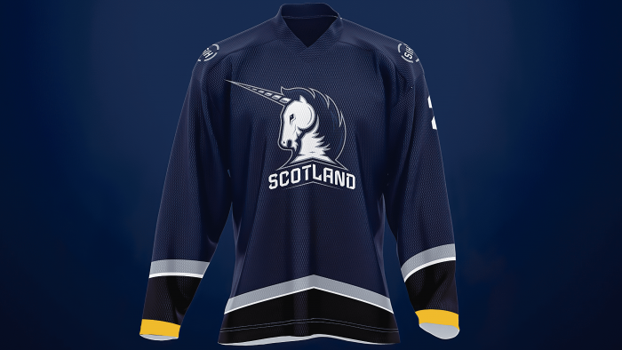
Another plus in the created logo is that by removing the graphic inscription and replacing it with another word, be it “Scotland” or “Scottish Conference,” the image will reflect the national character, the unification of forces for the sake of the goal, the readiness for challenges and directness.
To consolidate the successful image, it was decided to produce a special sports uniform in a single style. Therefore, the concept of “a shared path that everyone can join” opens up new sports and marketing perspectives for the hardy Scots.


