


![]() Scratch Logo PNG
Scratch Logo PNG
The bright and appealing Scratch logo symbolizes a playful approach to learning. It reflects the simplicity and accessibility of programming for users of all ages, as the service allows gradual mastery of coding basics. The emblem is associated with creativity, encouraging creative experiments.
Meaning and History
![]()
Designers reflected in the Scratch logo its name, which is actually not related to programming but to music. It comes from the term “Scratching,” a technique used by DJs involving spinning a record back and forth to create new sound effects. Similarly, the website allows users to create creative content by mixing different media files. Since it is designed for children and teenagers, its name is styled in a friendly way: the cartoonish white-orange inscription encourages learning the programming language in a playful form.
What is Scratch?
Scratch is a programming language designed to teach children ages 8 to 16. It was developed in 2003 by the Lifelong Kindergarten Group, based at the Massachusetts Institute of Technology. It has its own website where users can create and edit projects, including animations, images, music, simulators, and games.
2002
![]()
Although Scratch was launched in 2003, its working page on the Lifelong Kindergarten site appeared at the end of 2002. A logo unrelated to programming was used as a placeholder. It contained a promotional poster of an American hip-hop artist performing under the pseudonym Scratch. The emblem looked like a photograph turned sideways and hanging in a green space. It featured a smiling face on a red background, with the project name at the bottom in a white frame. The top of the photo card was creatively torn.
2003 – 2005
![]()
Until 2005, the site’s beta versions featured a logo with the black inscription “Scratch” on a gray background. The word was set in the Black Boys on Mopeds font, developed by Jakob Fischer, characterized by thin, asymmetrical letters with serifs.
2005 – 2007
![]()
When the website was under the domain Scratch.mit.edu, its logo was white with blurred gray shadows. It was also used in the “Scratch 1.x” project editors, where the menu bar was painted in gray.
2007 – 2013
![]()
The “Scratch 1.x” series programs began to be released in 2007. An orange wordmark with a linear gradient from dark (at the top) to light (at the bottom) was created for them. Each letter had a wide white outline following its shape and gray shadows of uneven thickness, which made the inscription voluminous. This emblem ceased to be used in 2013 when Scratch 2.0 was officially released.
2011
![]()
Even during the development phase of Scratch 2.0, an alternative logo design could be seen. Here, the orange glyphs became thinner, and their white contours merged into one large cloud, surrounded by gray shadows. The gradient’s shape also changed: light highlights shifted upwards, concentrating closer to the middle.
2013 – today
![]()
Designers created a new logo for Scratch 2.0 without the gradient. The brand name remained orange on a white background, but now, without different shades, the inscription seems flat. The uneven gray shadows were replaced with a solid blue outline resembling a child’s drawing of a cloud.
2015 – today
![]()
This logo was actively used after the release of the Scratch 3.0 program. Now, the word is painted in white and outlined with wide, bright orange bands. This allows the wordmark to be placed on any light background.
Symbol
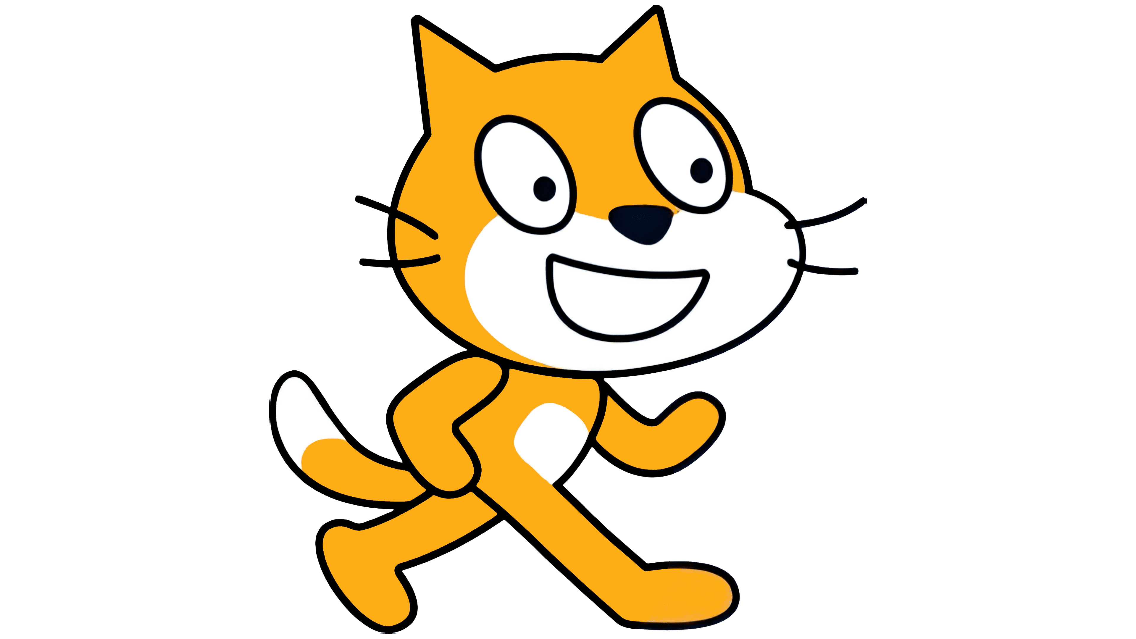
The website has its own mascot named Scratch Cat. It is also the starting sprite, meaning the character that appears in each new project and can be programmed to perform various actions. Artist Wing Ngan conceived the design. In the original version, it is an anthropomorphic red cat with white spots on its chest, face, and the tip of its tail. It smiles cheerfully and walks on its hind legs.
Font and Colors
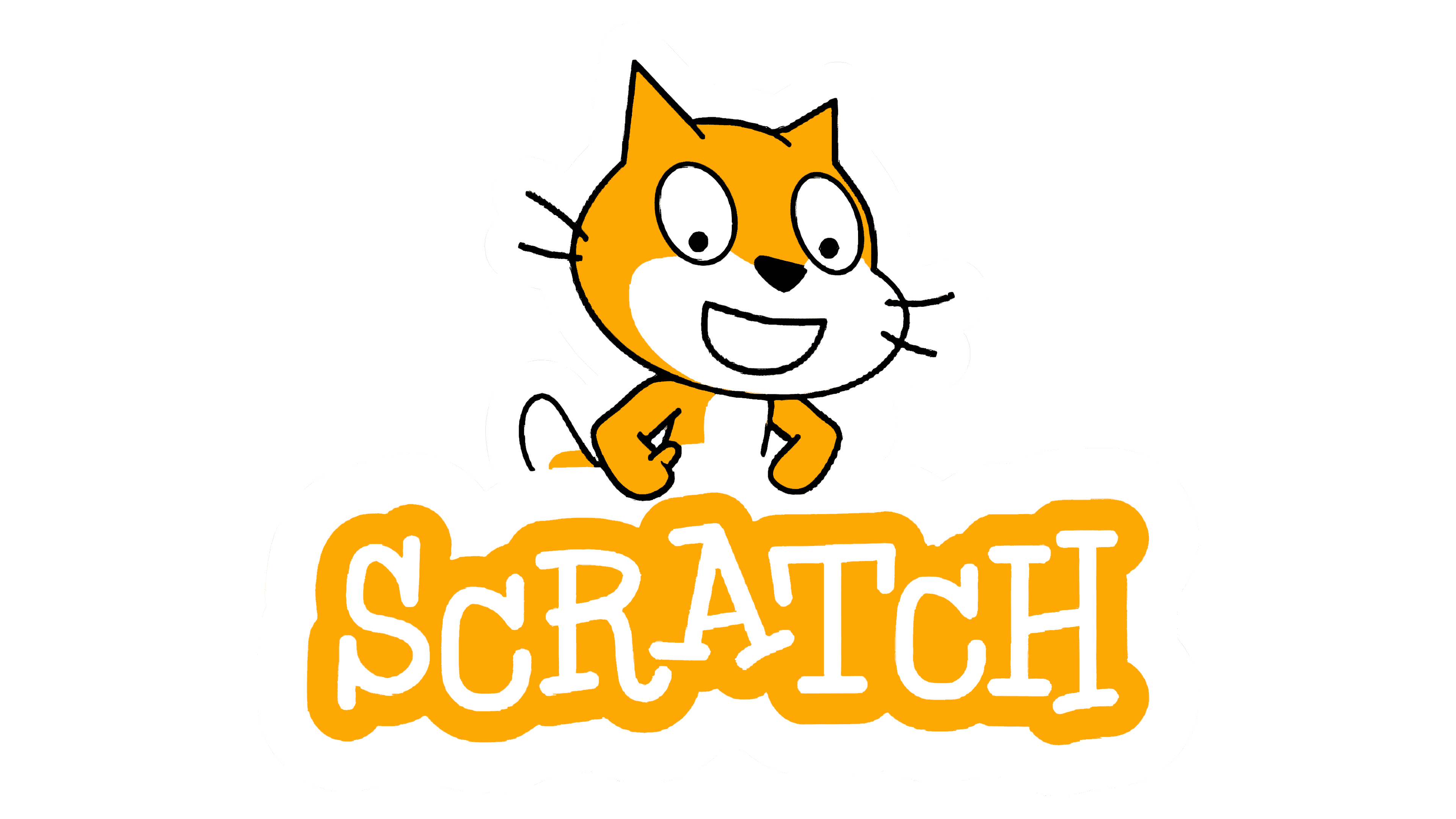
The programming language’s name is written in the Black Boys on Mopeds font, created by Jakob Fischer under the nickname Pizzadude. The letters are styled in a cartoonish manner and appear as if hand-drawn. They are asymmetrical, “bouncy,” with uneven serifs.
The Scratch logo has long used orange, a color associated with positivity and good mood. It symbolizes the ease of learning, as the program is adapted for children. Usually, orange is combined only with white, but some emblems also include blue or gray.