Founded in 2015 by Dan Doney, the financial blockchain company Securrency has reorganized its look and feel. The update was required due to major changes in its strategy and proposals. Over the years, the brand has developed its financial ecosystem characterized by unhindered access, no restrictions, and decentralization. The main goal was to solve the problems of access in various jurisdiction systems, getting out of the trap created by the imperfection of regulatory and institutional restrictions.
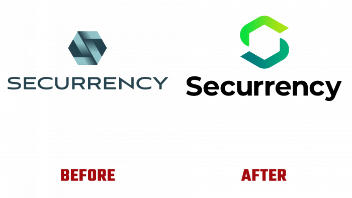
The new visual identity effectively reflects the brand’s optimism for its promising future, demonstrating the vision of a new financial institution, which is determined by all its actions. The main element of the visualization is the logo, the development of which was given the utmost attention. In keeping with its overall vision, design agency Drumroll has taken a creative approach to providing a new experience, despite the owners’ desire to keep the old graphics as much as possible. However, the new development better reflects the company’s current direction and conveys the important changes that the brand is making to the financial world.
The sign, which is the company’s symbol, is made in the form of a hexagonal core with a free inner area. This interpretation is a demonstration of responsibility for this space. At the same time, forming a visual perception of a symbol, as a number – a unit of account, representing a digital balance, which is a replacement for securities and opens up wide opportunities in the future. At the same time, the symbol can be perceived as the letter “S,” which is the first letter of the brand name, which provides a visual unification of all the information presented by the sign around the brand itself, “tying” the entire composition to it. This letter creates a single internal ecosystem, reflecting the actions of Securrency itself, striving to activate and ensure maximum security of the created visual token and all communities united by the brand itself.
The corporate color palette has also been transformed and acquired new colors. Playing with different shades of basic green is an effective allusion to the company’s past, present, and future, which is being formed today. These colors are vividly reflected in the design of the new site, which has an attractive interface, intuitive functionality, and a simplified search system. The new visualization was built taking into account the realities of today, including the speed of changes taking place in the field of the company. It provides for quick and easy changes, usability in future products.


