Established in 2014, Sendwave, a digital platform for money transfers between North America, Europe, and various regions in Africa, Asia, and the Americas, recently introduced a new brand identity. This update, designed by DesignStudio in London, represents a significant shift from the old branding and aims to reflect Sendwave’s commitment to enhancing global money transfer services.
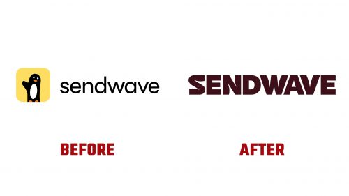
While memorable, the previous logo featured a charming penguin that did not relate to Sendwave’s mission of facilitating international money transfers. The playful penguin gave the brand a more informal feel, which may have impacted the perception of Sendwave’s professionalism and reliability.
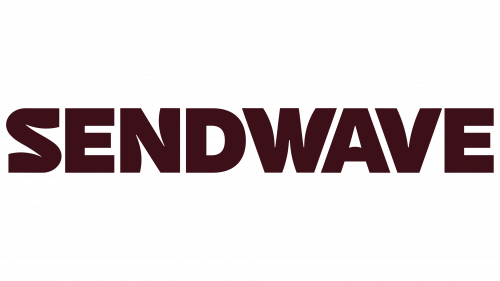
The redesigned logo shifts to a sophisticated, modern wordmark, aligning with contemporary design trends. This new logo incorporates nuanced, curvy gestures that subtly nod to the “wave” in Sendwave’s name, although the letters “E” and “D” lack these wavy details. This inconsistency is a notable design choice, especially when the “A” successfully incorporates a subtle wave. The “W” in the wordmark notably mirrors the angles of the “A” and “V,” creating a visual distraction that makes the “WAV” section stand out more than intended.
Additionally, the new branding introduces a monogram that cleverly combines up to three “S” shapes into a circular design. This design element effectively captures the brand’s name’s initial “S” and wavy nature. Accompanied by sleek animation, this monogram transitions smoothly into the brand’s signature graphics, enhancing the dynamic and fluid nature of the visual identity.
A significant aspect of the redesign is the custom typeface created by Florian Karsten Type Foundry. This typeface, characterized by bold, condensed letters with wavy gestures, complements the wordmark’s visual theme. While the typeface is distinctive and bold, it avoids appearing gimmicky by balancing expressiveness and practical functionality. The typeface also features an exceptionally unique design for the British Pound sign, adding to its distinctiveness.
The comprehensive overhaul of Sendwave’s visual elements—from the logo to the typeface—aims to boost the platform’s appeal and emphasize its role as a reliable service for migrants managing money transfers worldwide. The new identity projects a more polished and trustworthy image, which could help increase user trust and strengthen Sendwave’s position in the competitive digital transfer market.


