Traveler Made, a network of luxury travel designers, has delighted clients with luxury services for eight years. And now, the moment had come when the company decided to start its life from scratch in an era of social and economic transformation.
In connection with the global crisis, which arose against the backdrop of the coronavirus pandemic, it became clear that many businesses would decline. Industries such as travel and transportation have been hit hard by border restrictions and closures.
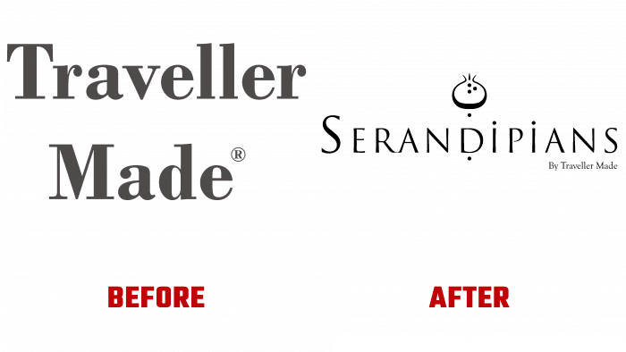
When it became clear that only strong transformations would keep the business afloat, the famous Traveler Made brand created a new identity.
As the founder and president of Quentin Desurmont put it, the pandemic was the right starting point for rebranding, the best time to create a new brand identity.
Traveler Made did not give up despite the general panic caused by the pandemic in the business community but decided to fight for the client to the end, even when in a difficult situation.
Three years have been hatching the idea of rebranding, and finally, the new identity is presented to the public. Many initiatives and projects have emerged to simplify travel and entertainment.
Traveler Made recently brought together a group of 30 VIP travel designers from the US, South Africa, Russia, Ecuador, and Lebanon in the Greek Islands for their first in-person event since December 2019.
When a powerful wave of changes swept the whole world, and the pandemic loosened its tenacious “paws,” the travel industry began to play with new colors, so a completely new legend has firmly entered the company’s rebranding to attract customers.
In the 18th century, Sir Horace Walpole came up with the idea that stemmed from an English variation of the Persian tale The Three Princes of Serendip. They allegedly made discoveries that they did not expect to make. Therefore, the connection with the concepts of discovery, novelty, surprise, and insight is incorporated into the concept of the new brand name – Serandipians.
The message broadcast to the public is openness to new achievements, travel, and adventure for a lifetime. This is why the company organizes inspiring travel-related events.
A luxurious, complex name must necessarily be combined with graphic elements that are woven into the legend.
A well-thought-out logo concept – a sophisticated font design with a light, one might say, the airy image of exotic fruit (similar to a fig), with its black outline hinting at sincerity and pleasant, joyful expectations from the upcoming event.
The fruit is depicted neatly in the middle of the front inscription. The entire logo is black, but this formality and severity do not diminish the admiration for the visual image. Placed here and there, dots hint at future adventures, new twists, and turns that await in the life of every client.


