The developer of the cloud computing platform uses an emblem that symbolizes its technology and progress. In doing so, the ServiceNow logo reflects the brand name and adorns the headquarters building as the main signboard, blending in with the architecture of the facade.
ServiceNow: Brand overview
| Founded: | 2003 |
| Founder: | Fred Luddy, David Loo, Don Goodliffe, Bow Ruggeri |
| Headquarters: | Santa Clara, California, U.S. |
| Website: | servicenow.com |
Meaning and History
At the beginning of its career, the digital company was called Glidesoft and had the status of a corporation. It was opened by a former employee of Peregrine Systems and Remedy Corporation, where he previously served as the head of the technology department. Moreover, Luddy was a leading specialist and was engaged in corporate software. Then he thought about continuing his activities and establishing his organization in San Diego with the same range of services as Peregrine Systems, which had already disappeared at that time.
At first, the founder worked independently, being both the head and the only employee. In 2005, he invited five people, which caused the software company’s profits to increase dramatically. At the same time, the head attracted 2.5 million dollars. Funding came from JMI Equity. After the growth of digital products, the company owner decided to rebrand and rename it ServiceNow. This happened in 2006. And in 2007, the innovation platform showed a record profit of $13 million. At the same time, the organization opened an office in Silicon Valley.
By 2011, the IT firm had several divisions employing 275 people. They were in San Diego, London, Atlanta, Chicago, Frankfurt, and New York. The software service also activated a partnership with Accenture, which had 100 consultants in ServiceNow. In 2012, the organization went public and moved its headquarters to Santa Clara while retaining the original emblem. The logo has gone through only one transformation. But, despite the redesign, he remained in the same style.
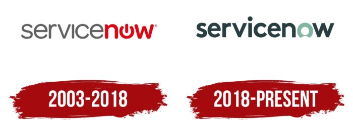
2003 – 2018
At the time of opening a digital company, the owner gave her an individual logo in the form of a text symbol with a graphic element inside. The visual identity sign was the full name of the software group, located on one line. The lettering was in lowercase and consisted of two stems of different styles: the word “Service” was typed in thin sans-serif letters and “Now” in bold.
The second part of the name contained a start button disguised as an “O.” It was an open ring, interrupted by a short vertical stripe at the top. In addition, the designers have demarcated both halves of the color, painting them in gray and red.
2018 – today
In the modern version, the logo palette has changed to gray-green. And only the letter “O” remained selected. She also changed shape and turned from a “button” start to a wide ring with a notch at the bottom. Other signs have also become bold. The developers converted them to lower case and added straight lines on the cut, while before, they had rounded ends.
ServiceNow: Interesting Facts
ServiceNow is a cloud computing platform that has changed how businesses handle and automate services. It was started in 2004 by Fred Luddy to make it easier for people to manage work through a company by automating services. This idea has greatly influenced the IT service management industry.
- Starting Point: Fred Luddy founded ServiceNow in 2004 to automate service processes using a cloud-based platform, reshaping IT service management.
- Going Public: In June 2012, ServiceNow’s IPO marked it as a key player in cloud computing for businesses.
- Broadening Scope: Initially focused on IT service management, ServiceNow now offers tools for HR, customer service, and security, supporting a wide range of business operations.
- Ease of Use: ServiceNow emphasizes easy-to-use, no-code, and low-code options, letting non-technical users quickly develop apps and workflows.
- Smart Technology: It incorporates AI and machine learning for smarter automation, including predictive analytics and chatbots, making tasks easier and more efficient.
- Global Use: ServiceNow helps over 6,200 customers globally, including most Fortune 500 companies, highlighting its reliability and scalability.
- Innovation: With updates every six months, ServiceNow keeps up with tech trends and adapts to changing business needs.
- Now Platform: The core of ServiceNow is the Now Platform, a flexible system that lets businesses manage workflows and processes in various areas.
- Community and Market: A strong community of developers and users grows around ServiceNow, with a marketplace for apps and integrations encouraging collaboration.
- Recognition: ServiceNow has won many awards for its technology and company culture, including top marks from Gartner for IT service management tools.
ServiceNow has significantly impacted service management and automation, improving efficiency for companies worldwide and leading the way in digital workflow transformation.
Font and Colors
The logo retained its original style despite the modification: a strict inscription placed in one line. The designers paid special attention to the font, conveying the meaning and concept of the software company through it. And it consists of practicality, minimalism, a business approach, sampling the main thing, and cutting off irrelevant details.
The ServiceNow platform chose a simple and clear typeface from the Arial family for the emblem. Thanks to smooth sans-serif letters, it is visible even at a cursory glance and is easy to read. The corporate palette is based on a combination of dark and light colors. Previously, they were gray and red; now, they are dark green (still closer to graphite) and turquoise.
ServiceNow color codes
| Outer Space | Hex color: | #293e41 |
|---|---|---|
| RGB: | 41 62 65 | |
| CMYK: | 37 5 0 75 | |
| Pantone: | PMS 5467 C |
| Green Sheen | Hex color: | #81b4a1 |
|---|---|---|
| RGB: | 129 180 161 | |
| CMYK: | 29 0 11 29 | |
| Pantone: | PMS 563 C |


