


![]()
SG Painting has introduced a new logo highlighting its expertise in painting and finishing services. The updated design combines bold typography with a visual reference to the company’s work, creating a strong and recognizable identity.
The standout feature of the logo is the large letter “S,” designed with a solid, monolithic look. The element anchors the composition, giving it a stable and confident presence. A paintbrush graphic is seamlessly integrated into the upper part of the “S,” making it appear like the letter was created with a painter’s stroke. This detail reinforces the connection to the company’s craft.

Below this symbol, the company’s name, “SG Painting,” is displayed in a bold, sans-serif typeface. The geometric structure of the letters, combined with clean lines and thick proportions, keeps the design clear and easy to read. The compact, evenly spaced text adds balance to the overall composition.
The color scheme consists of two main tones: deep red for the primary graphic and white for the text. Red conveys energy and precision, reflecting the company’s commitment to craftsmanship. The white background creates a strong contrast, making the design stand out across different applications.
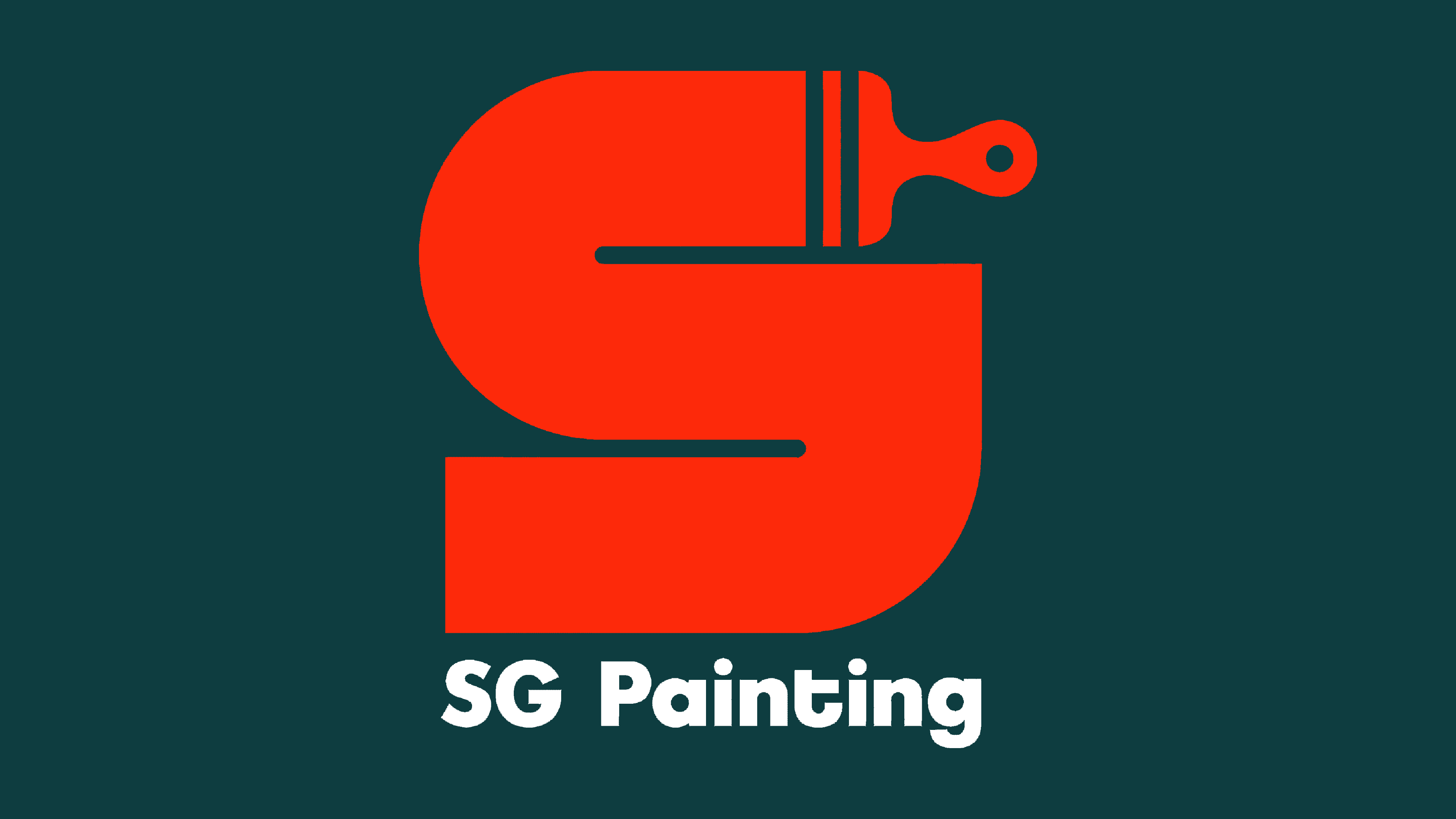
SG Painting’s new logo is functional and adaptable, combining a distinctive symbol with straightforward typography. The paintbrush element woven into the letterform directly connects the brand to its industry, making the design relevant and easily recognizable. The update gives the company a modern, confident look while staying true to its expertise.