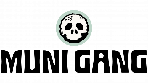
Muni Gang, a golf brand crafted for casual enthusiasts, is shaking up the industry with a fresh brand identity that promotes accessibility and shuns elitism. Tailoring its message to golfers who opt for municipal courses over costly country club fees, the brand’s relatable ethos is evident. The Muni Gang logo fuses a golf ball with a skull in an unorthodox design, emphasizing the ball’s dimples while showcasing a rugged appeal.
This rebrand employs Hank Makes’ Paloma typeface in its wordmark, an updated take on the classic Hobo font. This choice of typography enhances the brand’s informal and laid-back spirit without sacrificing quality or aesthetics. As evidence, sample designs for potential merchandise like stickers and apparel showcase exceptional design artistry. The typeface and visuals harmonize, making for a visually engaging experience.
Muni Gang incorporates photography and select spot illustrations to further cultivate its easygoing and relatable atmosphere. The imagery projects an environment akin to hanging out with friends, with light beers and a relaxed ambiance. Far from being a brand that settles for mediocrity, Muni Gang proves that a laid-back approach and high-quality design coexist.
Golf often carries a reputation as a sport confined to the elite, typically accompanied by rigid dress codes and private club memberships. Muni Gang disrupts this traditional narrative by adopting the spirit of community golf. Here, the only real requirement is to wear pants, a cheeky nod to inclusivity and the absence of pretentiousness. This fresh approach to branding finds a welcome audience among those who have long felt estranged by golf’s more exclusive aspects.
With its groundbreaking rebrand, Muni Gang is forging a new path that challenges established norms and perceptions in golf culture.


