The organization’s corporate identity was developed by the Superunion agency, inspired by the spirit of activity.
The Shelter is a charitable organization founded in 1966. Based in England and Scotland, Shelter is committed to helping the homeless or poorly housed. According to the organization itself, everyone has the right to a safe home, and the dire housing situation negatively affects people’s lives. The organization researched the population and found that one in three adults suffers from housing problems in the UK.
Shelter expects to help 17.5 million people through campaigns, lawsuits, helplines, and events. The causes of housing problems among the population: poor condition of houses, discrimination based on race, gender, sexual orientation, or even disability. Superunion created a unique corporate identity for the charity, and Who Wot Why helped launch a national campaign.
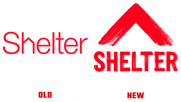
The first change is the logo change. The previous image was created in 2004 by Johnson Banks, transforming the letter “h” into a house. The new logo features an upward arrow in vibrant red. The image is made with a brushstroke and invites you to participate in events and demand changes. The previous logo was a great example of brevity and simplicity, but when the situation is only heating up, you need to be bold and fast.
The arrow on the logo also resembles the roof of a house, perfectly representing Shelter’s main business. Thanks to its simple design, the logo conveys a sense of urgency and can be easily interpreted by anyone on the poster without any design skills. Special attention should be paid to photographs of people who show the new Shelter symbol with their hands.
The main idea behind the rebranding is to remove all stereotypes about charity and instead instill a sense of urgency and urgent need to reverse the negative trend associated with housing stock in the UK. The slogan of the campaign launched by the organization “Fight for Home” again demonstrates Shelter’s determination.
A font complements the corporate identity without brush strokes and black and white photographs combined with red details. Bold headlines appear in outdoor and online advertisements, as well as in print.


