Founded in 1989 as a regional software reseller, Software House International evolved with SHI’s new name. It was more than a marketing move. The brand sought to demonstrate what was at the core of its ethos with it. SHI is the removal of a huge focus on everything that happens outside of formal contracts, ensuring the real success of each client. It reflects the values offered by the brand, which cannot be reflected in standard agreements where there is nothing about the actual level of service provided by the company. The incredible benefits of the offerings cannot be accounted for and guaranteed by any document. At the same time, the brand takes great care of many details, including managing suppliers, organizing logistics, expediting purchases, and dealing with IN-assets, giving the customer a more rational use of his time.
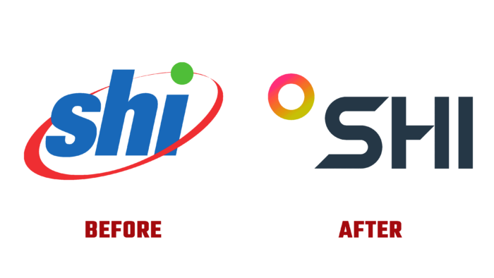
For almost 20 years, SHI has used the same logo despite the changes that have taken place, especially within the organization itself, which has grown into a growing network of experienced resources, constantly growing and expanding professionally, changing by the latest technologies. Like the previous version, the new logo is a representation of the name but in an original font that supports the image of a modern, electronic technology company. To ensure that the text is easy to read, minimal tracking was used, clearly separating each letter from the other. This, as well as the use of modern technology to provide clear contours of the text elements, ensured its readability in all sizes while maintaining a minimalist approach.
A symbol of constant development and progression, the slanted circle, changing in thickness, was transformed into a regular circle, which simultaneously symbolizes infinity in development and completeness of the brand’s formation as an established structure. At the same time, it communicates the owner’s desire to become the center of ensuring success for their clients.
The palette of colors used is not diverse; while maintaining adherence to the chosen style, Black was chosen as the main hue, providing the necessary contrast when placing the logo in print and digital media. But to draw attention to the visualization of the symbol of the circle was made in a raster version – the use of shades of red to light green. This accent element provides the logo with recognizability and attractiveness.


