Threads of communication underlie the logo. Their interlacing creates an intricate pattern of service points, customers, payment services, and bank cells. The Simple logo demonstrates the bank’s and customers’ connection through online channels.
Simple: Brand overview
| Founded: | 2009 |
| Founder: | Shamir Karkal, Alex Payne, Joshua Reich |
| Headquarters: | Portland, Oregon, U.S. |
| Website: | simple.com |
Simple is a virtual bank without physical branches. It operates through online banking, an official website, and mobile applications for Android and iOS. It provides Visa cards to account holders. Simple is part of the Allpoint network and has free access to 55 thousand ATMs. It is part of the BBVA Group, one of the largest financial institutions in Europe. In November 2020, together with him, it came under the jurisdiction of PNC Financial Services Group, Inc.
This organization’s activity started in 2009 when it was founded by three financiers: Alex Payne, Joshua Reich, and Shamir Karkal, who took key positions in management. They have worked as CTO, CEO, and CFO. The virtual banking structure they created was first concentrated in Brooklyn. A few years later (in 2011), her office moved to Portland, Oregon (USA).
The change of location was due to strong financial support from several investors and one fund. The bank opened a head office in the new city, collecting interest on customer deposits and charging an exchange commission. In the winter of 2014, it was acquired by one of the largest banks in Europe—Banco Bilbao Vizcaya Argentaria. At the end of autumn, as part of BBVA, Simple moved to PNC Financial Services Group, Inc.
Meaning and History
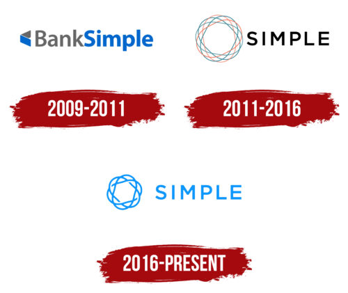
Each key stage in the bank’s work was reflected in its symbolism. The main changes occurred at the start of his career, with the expansion of his move to Portland and after his purchase by BBVA. In total, Simple has three emblems.
The logo of this bank was a continuation of its concept: ease of use and ease of maintenance. Indeed, unlike classical institutions, they did not have their branches. Clients only used online banking through the system or mobile platforms iOS and Android. Therefore, the visual identity was as simple as possible: a circle formed by several intertwined lines. Different numbers were depending on the period. The simplest logo refers to 2014: it had a ring formed by three wavy stripes. They were assembled like a Möbius strip. In total, the bank has three emblems because, in 2021, it ceased to exist.
What is Simple?
Simple is the first neobank in America, a bank that operates exclusively online and does not have physical branches. It was created in 2009 and only existed for 12 years, closing in 2021.
2009 – 2011
At the beginning of its work, the bank adopted a laconic logo that echoed its name—BankSimple. It was simple and consisted of a miniature icon on the left and text on the right. The icon depicted a wallet; next to it was the full name of the banking and financial organization. Both elements were bi-colored and consisted of blue and white. The phrase was written in one piece, with each stem highlighted in capital letters.
2011 – 2016
In 2011, the developers removed the word “Bank” from the title, leaving only the second part. They also changed the inscription’s font: “Simple” got a chopped typeface with free inter-letter space. All symbols are crisp, clear, and legible. Geometric letters emphasized the seriousness of the banking structure.
In contrast to them, there was an icon, which consisted of an interweaving of many lines. They were an allegory for a virtual network since the bank had no physical branches. The red and blue stripes symbolize the cable and communication paths with customers and indicate many services within their structure.
2016 – today
As a result of the redesign, the number of intertwined lines has been greatly reduced. There are three of them left, and they are more like links of a single chain that is closed on itself. The circle is uneven, with arches protruding along the outer edge. Next is the word “Simple” in blue—the designers have removed black from the logo. The letters’ shape and size remained simple, smooth, and grotesque in upper case.
Simple: Interesting Facts
Simple Bank, a trailblazer in online banking, made a big splash in fintech before closing in 2021. Its approach to banking changed how we think about managing money digitally.
- Start: Joshua Reich and Shamir Karkal founded Simple in 2009 to make banking more user-friendly, directly integrating budgeting and saving tools into accounts.
- Mobile Banking: Simple was one of the first to focus on mobile banking, using smartphones to change personal banking with an easy-to-use app.
- No Overdraft Fees: Simple doesn’t charge overdraft fees, promoting transparency and fairness while adhering to its mission of a better banking experience.
- Goals Feature: Its “Goals” feature lets users save for specific things from their checking accounts, making money management easier.
- Safe-to-Spend®: The “Safe-to-Spend®” feature showed users what they could afford to spend after accounting for bills and savings, aiding in budgeting.
- Acquisition by BBVA: In 2014, BBVA acquired Simple, aiming to blend Simple’s tech with BBVA’s broad financial services.
- Closure: BBVA USA announced Simple’s closure in January 2021, part of a consolidation after BBVA USA was acquired by PNC Financial Services, leaving many customers disappointed.
- Culture and Community: Simple stood out for its unique culture and dedication to customer service, building a strong user community.
- Industry Influence: Simple’s approach challenged old banking models and showed how fintech could lead industry changes, focusing on tech and customer needs.
Simple’s approach to banking—emphasizing innovation, design for the customer, and transparency—continues to inspire the fintech sector even after its closure.
Font and Colors
Since the bank is virtual, the management decided to focus on this and chose elements for the logo that resemble wire communication as much as possible. These are thin lines connected like a cable. They also symbolize customer communication through mobile applications for smartphones and tablets, online banking, and the official website. Each option emphasizes that using this bank is simple, as indicated in its name.
According to the Simple concept, the round icon is a conceptual guilloche pattern that resembles a ring. This complex pattern consists of simple geometric lines repeated in a specific order. This logo design is directly related to finance because guilloche is an element of almost all currencies. It is found on banknotes and is a designation of security and authenticity.
The bank chose the Gotham typeface by Hoefler & Frere-Jones for its logo. She moved into typography from American signage in the early 20th century. With the advent of modern technologies, it again gained relevance, as it had an appropriate design. The developers only slightly changed the font, adapting it to the bank’s requirements and making it as simple as possible. The emblem’s color scheme is also simple and consists of blue on a white background.
FAQ
Does Simple Bank still exist?
Simply put, an online banking service no longer exists. It officially closed on May 8, 2021, and customers’ accounts were moved to BBVA USA checking and savings accounts.
The brand had features to help users manage their finances better. One feature was the automated round-up savings tool, which helped customers save $1.2 million in under four months by February 2020.
The brand could not continue alone. BBVA USA, which bought the company in 2014, integrated the brand into its services, which led to the closure of and the transfer of its customers’ accounts to BBVA.
Is Simple a good bank?
According to many users, Simple was a good bank. It offered high-yield checking accounts with an APY higher than many savings accounts, making it attractive for maximizing earnings. The brand provided unique budgeting tools to help track goals and automate savings for immediate and long-term expenses. These features were designed to simplify financial management and make it easier for customers to manage their finances.
Despite its benefits, the brand is no longer in operation. While it offered valuable features and was well-regarded, customers now need to explore other banking options or use BBVA USA for their financial needs.
Who owns Simple Bank?
BBVA, a Spanish banking group, is owned simply. BBVA bought the brand in 2014 to expand its digital banking services. The goal was to add Simple’s innovative features to BBVA’s offerings.
In January 2021, BBVA announced it would close the bank later that year. The official closure happened on May 8, 2021. After the shutdown, customer accounts moved to BBVA USA, allowing them to continue using banking services through BBVA’s platform.
What is a Simple logo?
The logo is easy to recognize. It features the name “Simple” on the right side in a clean, modern font. On the left side, a complex geometric shape looks like a mandala. This shape is intricate and symmetrical, with interlocking lines and patterns.
The logo is light blue, conveying a sense of calmness and trust. The clean font and detailed geometric design make the logo stand out and easily recognizable.
The geometric shape symbolizes the brand’s innovative approach to banking. It suggests harmony and balance, reflecting the brand’s goal of helping users manage their finances smoothly.
When was Simple founded?
Simple was founded in 2009. The idea came from Josh Reich, who was frustrated with hidden fees, unnecessary products, long holds, and complicated banking conversations. He emailed his friend Shamir Karkal and asked why banking had to be so complicated.
This question led to a new bank designed to simplify the banking experience. Josh and Shamir aimed to eliminate common frustrations with traditional banks. They wanted a user-friendly and transparent banking service that prioritized customer needs. Their goal was to offer straightforward services without hidden fees or unnecessary products.
The company’s mission was to make banking easier and more accessible. To change the banking industry, they focused on innovation and customer experience. The bank quickly became popular for its clear and easy approach, attracting users tired of traditional banking complexities.

