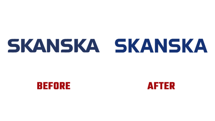
In 1887, a concrete factory was founded in Sweden, which, over 135 years, has grown into the world’s largest real estate development and construction company called the Skanska Group. Today, through the productive application of knowledge and effective use of foresight, the brand has expanded its reach into the building markets of Nordics, Europe, and the United States. The company is characterized by creating innovative and sustainable solutions that support a healthy lifestyle throughout the life of the facilities under construction. Pursuing the dual goal of innovating and creating something that will be useful for people and society, the brand develops, designs, and builds everything safe for health and the environment, from office buildings to smart homes and infrastructure. To better reflect its modern essence and the desire to innovate and respect its founding values constantly, the brand has developed its new positioning, making changes to its own visual identity.
With the help of the new visualization, Skanska’s core values were reflected while demonstrating the understanding that any decision has its permanent impact. The whole design concept was built on constructability, shapes, precision, innovative solutions, and clear architectural markers. The traditional story of the brand was presented in a modern way with enhanced visual appeal and how it contributes to lifestyle.
The new logo used an improved mathematical and geometric approach in the formation of graphic images and word form. Although this option was not particularly good for displaying a letter like “S,” the high degree of precision and balance of all other characters ensured the entire text block’s smoothness, cohesion, and strength. The effect of improving the visual perception of the text has been enhanced by the use of complex kerning and indentation, which has done the best job for the sake of comfortable viewing of the image.
The purity and clarity of the created logo create the best conditions for its use in large fragments; they become abstract forms in layouts that create a feeling of powerful and solid physical engineering and large-scale built-up environments. With the applied bright illustrations and photographs, simple typography, characterized by a non-standard identity in its simplicity and conciseness, turned out to be effective and encouraging. The brand’s identity has been shaped by a family of custom fonts that symbolize the company’s attitude towards the individuality of each of its projects. All this has become a solid foundation for building a system that creates a sense of trust and reliability.


