


 Skechers Logo PNG
The well-known American brand used the Skechers logo twice: in some cases, a single letter “S” appears on the shoes, and in others, the full name. The label is elegant, textual, and strict. It inspires confidence in the product’s excellent quality. Although the old and new versions differ in italics, they are both smooth, grotesque capitals.
Skechers was founded in 1992 by Robert Greenberg and his son Michael after Robert left LA Gear, the footwear company he had built in 1983, which had become a major fashion-sneaker business with nearly $1 billion in revenue by 1990. The new company began in Manhattan Beach, California, first distributing Dr. Martens shoes made by R. Griggs Ltd.
After the Dr. Martens partnership ended, Skechers shifted to its own products. In 1993, the Chrome Dome boot became its first major item, a heavy, unisex, grunge-style shoe sold through Nordstrom and Foley’s. By 1995, annual sales reached $100 million. That year, the company opened its first store and stopped distributing “Cross Colours” and Karl Kani to focus on its own line.
In 1997, Skechers began international expansion and launched Skechers Kids. In 1998, Skechers Sport moved the brand into athletic footwear, a segment dominated by Nike. The company went public in 1999, aiming to raise $115 million, and Footwear News named it Company of the Year in 2000. Stores then expanded across Europe and Asia.
Skechers Performance launched in 2011, the same year the company signed marathoner Meb Keflezighi, who later won the 2014 Boston Marathon in Skechers shoes. Its Shape-ups line led to a 2012 FTC settlement of $40 million over unsupported fitness claims, after a similar Reebok case. In 2013, Memory Foam helped rebuild sales. In 2025, 3G Capital acquired Skechers for $9.4 billion, while the Greenberg family kept a minority stake and leadership roles.
Meaning and History
In 2018, the expansion of the headquarters began: exhibition halls, design, and office space gradually doubled in size. This led to a change in the logo as a major visual identity update was planned to transform Skechers into the most imposing center in South Bay.
What is Skechers?
This brand makes comfortable and stylish footwear for the whole family. Its models are known for comfortable insoles that adapt to the foot and a wide range of options to suit every taste. You can find footwear for work, walking, sports, and leisure here. Fashionable sneakers from a series with a unique design and comfortable running models have gained particular popularity. The brand offers both classic solutions and bright, attention-grabbing options.
1992 – 1998

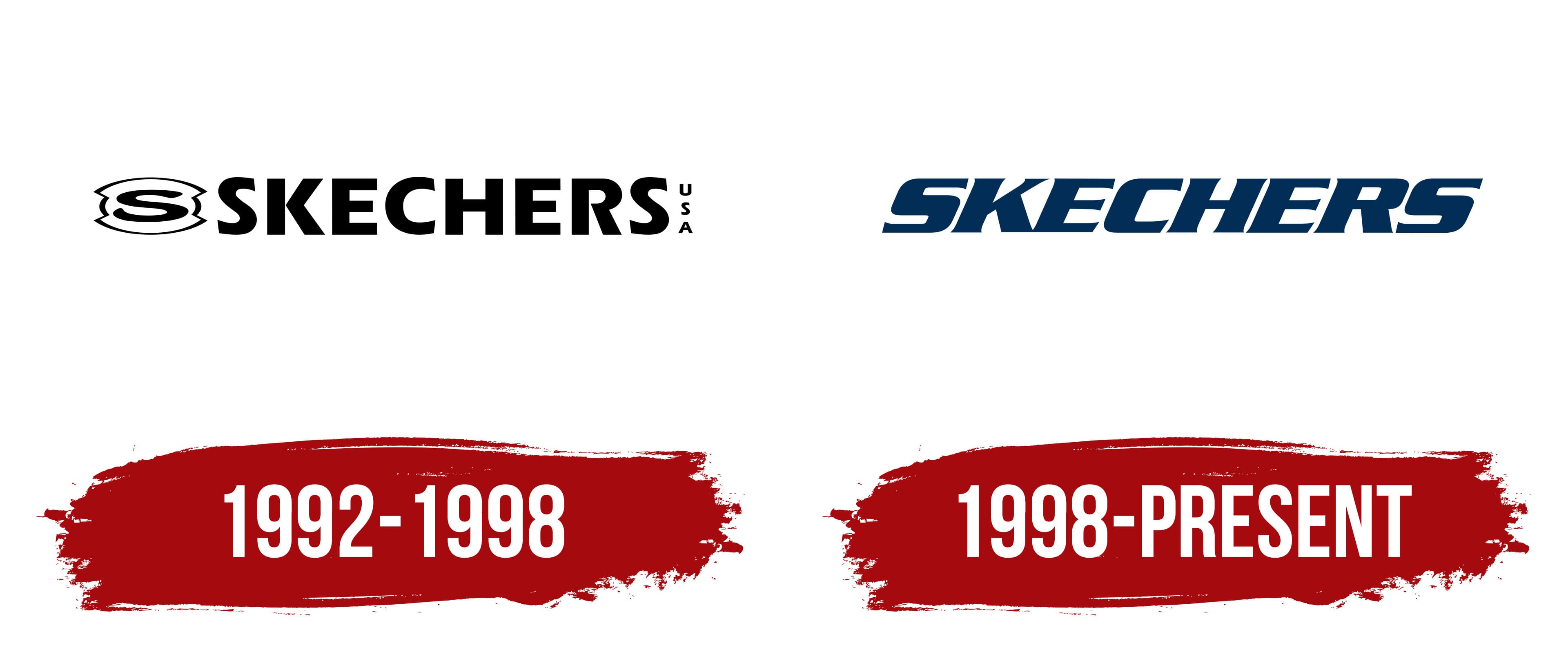
The debut logo consisted of a small icon and an inscription. The brand name was done in standard uppercase print glyphs. Even the wide letters were set with a small separation between them, so the text looked compact and easy to read. In front of him was a label with a capital “S” in a curly frame. It was extended in breadth and corresponded to the inscription’s height. On the right side, the country that owns the trademark was indicated. But the letters were not horizontal, but vertical, and were much smaller than the others.
1998 – today
The current Skechers logo is radically different from the past. It has more personality. Stylish letters are elegantly inclined to the right and made with thick lines. Each of them has an extension at the end that serves as a serif. The inter-character spacing is much smaller than before, but readability has not been lost. The block “S” is separated into separate signs. It is often used on shoes, while the full name serves as the official logo for documents and more. In addition, the designers have replaced the boring black color with dark blue.
Font and Colors

The evolution of the Skechers logo is associated with updating the font and separating the capital “S” into an independent icon. The reason for this step was the company’s large-scale expansion. At that time, she had large showrooms, offices, and design areas, which changed her visual identity. So the manufacturer has demonstrated its seriousness, progressiveness, and professionalism.
In the first emblem, the font is close to Marta Bold from FontSite Inc., and in the second, to Serpentine Bold Oblique. Thus, standard letters are replaced with sophisticated, elegant ones to demonstrate the brand’s connection to the fashion world. The color palette is restrained. At first, it was monochrome, but in the modern version, it is dark blue. Sometimes there is gray, which is used to color the frame of a single “S.”