


![]() Skype Logo PNG
Skype Logo PNG
The concise style of the free text, voice, and video communication software matches its owner’s style: vivid and memorable. The Skype logo reflects the essence of the brand and its services, as well as the virtual proximity of communication.
Skype grew out of earlier work by Niklas Zennström and Janus Friis. In 2000, they launched Kazaa, a P2P file-sharing network that spread quickly after Napster closed. Legal pressure forced a sale in 2003, and they moved to a new idea.
The same P2P logic was applied to voice. An Estonian team led by Ahti Heinla, Priit Kasesalu, Jaan Tallinn, and Toivo Annus built the core. The product was first called Skyper, then shortened to Skype.
On August 29 2003, a public beta appeared. Calls between users were free, without telecom tariffs. Growth relied on word of mouth. By 2005, the service reached over 50 million users. Paid features such as SkypeOut and SkypeIn supported revenue.
On September 12 2005, eBay acquired Skype for $2.5B with potential add-ons. Integration failed, and by 2007, the founders left. eBay wrote down $1.4B of the asset.
In 2009, eBay prepared for a sale. Zennström and Friis challenged Joltid’s licensing, forcing a settlement. A consortium led by Silver Lake, with Andreessen Horowitz and CPPIB, bought a 65% stake for $1.9B.
In May 2011, Microsoft acquired Skype for $8.5B. In 2013, it replaced Windows Live Messenger, bringing over 100 million users with it. Registered accounts exceeded 300 million.
Competition from WhatsApp and FaceTime reduced consumer share. In 2015, Skype for Business launched, but in 2017, Microsoft shifted to Teams. By 2021, support had ended, and by 2023, daily users had fallen to 36 million.
Meaning and History
![]()
To compete with traditional telecommunication networks, the Skype platform had to attract attention. For this, it needed a bright, memorable logo, which the developers handled when the program was released.
What is Skype?
Skype is a telecommunication application designed for voice calls and instant messaging. Released in 2003, it is based on the VoIP protocol. It was developed by Swiss entrepreneur Niklas Zennström, Dane Janus Friis, and Estonians Toivo Annus, Jaan Tallinn, Priit Kasesalu, and Ahti Heinla. The software is now owned by a Microsoft subsidiary, Skype Technologies.
2003 – 2004
![]()
When the new service combining video chat and messenger appeared, it had an unusual emblem with the word “skype” in merged circles. The designers used dark red for the graphic part and white for the word. To arouse interest, they added a gradient to the palette.
2004 – 2005
![]()
In 2004, artists outlined the logo with a clear contour, adjusted the gradient, and reduced the red’s intensity, replacing it with a scarlet shade.
2005 – 2006
![]()
Another redesign led to a change in the palette. The background became light blue, and the inscription – blue.
2006 – 2012
![]()
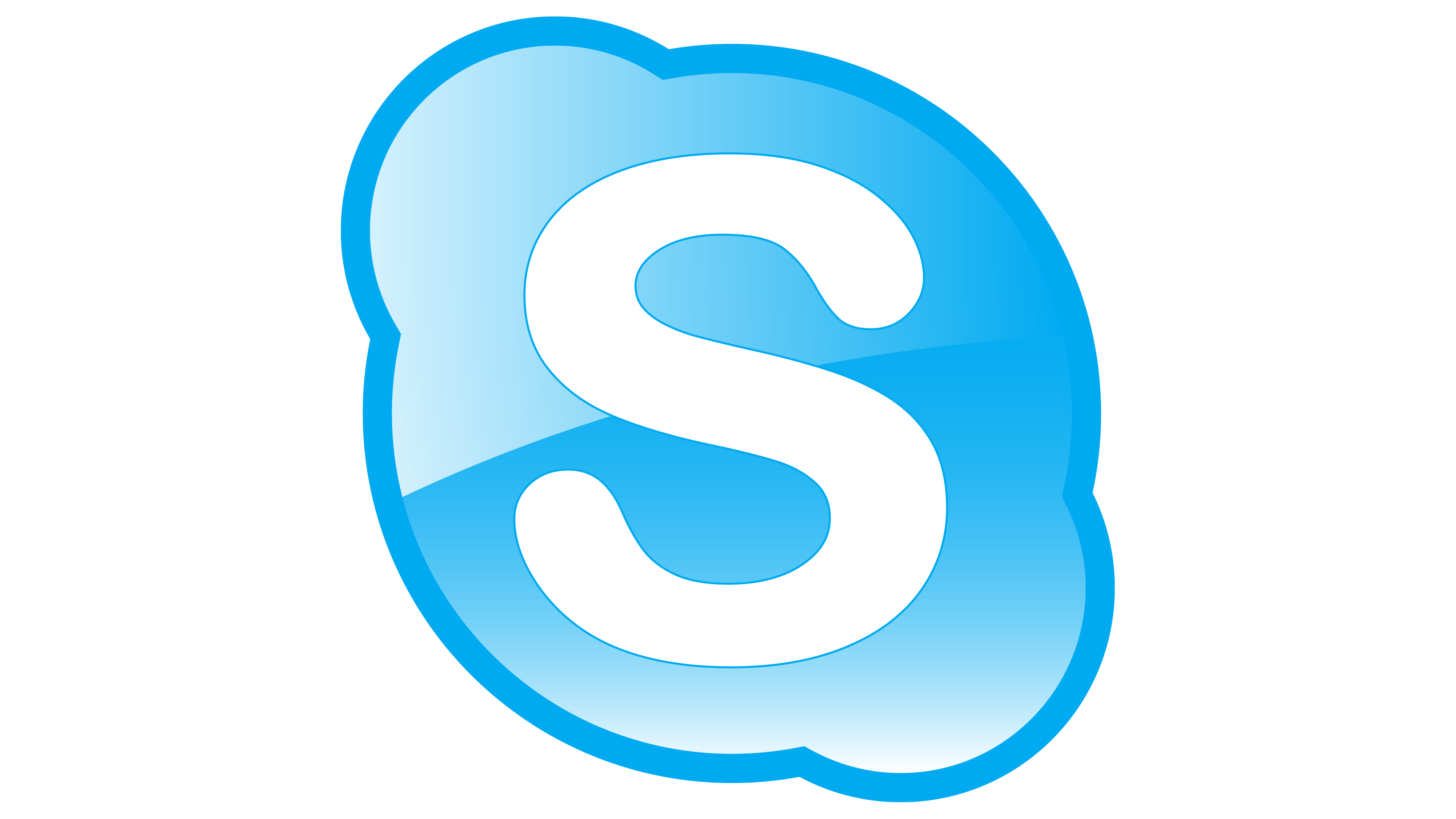
In 2006, Skype got an emblem similar to the 2003-2004 version. The only difference was that instead of red, the designers used blue.
2012 – 2017
![]()
Microsoft, which bought Skype in 2011, ordered a change in the logo. A year later, a version without a gradient and a thin contour line was presented.
2017 – 2019
![]()
In 2017, the program received a new logo to better match Microsoft’s branding. It consisted of two elements: a round geometric shape with the letter “S” (left) and the inscription “Skype” (right).
2019 – today
![]()
The modern icon was introduced on August 16, 2019. It does not include the program’s name; it only shows the letter “S” inside merged blue circles.
Font and Colors
After acquiring Skype, Microsoft sought to preserve the brand’s original image. However, it made several changes so that the new logo would harmonize with other Microsoft corporate symbols. It had to change the proportions and remove the inscription. At the same time, it kept the blue-and-white palette and the cloud shape.
In the old Skype emblems, the Arial Rounded MT Bold font was used. After the extensive redesign conducted under Microsoft’s guidance, the letters looked different. The developers focused on thin lines and removed the rounded ends.
Until 2005, the main color was red. Then, the program became associated only with shades of blue, diluted with light blue and white.