


![]() Slack Logo PNG
Slack Logo PNG
The Slack logo demonstrates multiple channels of communication. The system enables communication at both global and personal levels, bringing users together around a central theme. The emblem represents the messenger as a great utility program.
Slack began in 2009 at Tiny Speck, founded by Stewart Butterfield, the co-founder of Flickr, which was acquired by Yahoo in 2005. The team worked on the online game Glitch and built an internal messaging tool to coordinate across offices.
In November 2012, Glitch was shut down after failing to gain an audience despite over $15 million in funding. Instead of closing the company, Butterfield focused on the internal tool, which proved more useful than the game itself.
In August 2013, Slack entered closed beta, attracting over 8,000 company requests in the first day. The public launch followed in February 2014. The name stood for “Searchable Log of All Conversation and Knowledge,” reflecting its function.
Growth was rapid. By August 2014, Slack reached over 120,000 daily users. By the end of 2014, recurring revenue was increasing by about $1 million every eleven days. Its design, shaped by MetaLab, contrasted with Microsoft’s enterprise software.
By 2015, Slack had raised $340 million and reached more than 2 million daily users. In June 2019, the company went public on the New York Stock Exchange through a direct listing under the ticker WORK, reaching a valuation of $21.4 billion.
In November 2016, Microsoft launched Teams as a competitor to Slack. In December 2020, Salesforce announced the acquisition of Slack for $27.7 billion, which was completed in July 2021. In December 2022, Butterfield stepped down as CEO and left the company in early 2023.
Meaning and History
![]()
One of the best business applications might not have emerged if Tiny Spec hadn’t created Glitch. During its development, a messaging service was invented that would later serve as the basis for Slack.
The corporate messenger was launched in August 2013. It used a logo with a colorful hashtag rotated 18 degrees. Users had grown accustomed to the company’s corporate identity, so they were outraged when it changed the octothorpe’s design. People looked at the new symbol for the four ducks, the swastika, and the Google Photos app icon.
What is Slack?
This is the name of the American company and its flagship product, the messenger developed by Slack Technologies in conjunction with Salesforce. The client is designed for instant messaging between employees within the same enterprise.
2013 – 2019
![]()
The first emblem appeared even before Slack itself. It contained two elements, one of which was a pound sign. The hashtag consisted of four rounded strokes: red, blue, green, and orange. Where the stripes overlapped, complementary colors were used to make the image appear semi-transparent. Despite being two-dimensional, it added depth.
The messenger’s name was written to the right of the octothorpe, balancing the color palette with a restrained gray. The designers chose the Larsseit ExtraBold font, setting all letters to lowercase. Thanks to the lack of serifs, the word was easy to read even at a reduced scale.
2019 – today
![]()
Slack owners had several complaints about the first logo:
- It didn’t look good against a bright background because of its complex palette, which contained 11 colors.
- The lattice sign lost its appeal when placed at the wrong angle.
- The company had to use several versions of the logo that had nothing in common.
For example, the app icon was missing a hashtag.
To make visual identity more consistent, Slack executives turned to design agency Pentagram for help. Responsible for the image change was Michael Bierut, creator of the famous Hillary Clinton and Mastercard logos. After a long creative search, experimenting with different forms, he decided to keep the original octothorpe but change its style. As a result, the sign became more abstract.
The new logo embodies the original spirit, although it uses far fewer colors and lacks the usual transparency effect. The disappearance of overlapping elements makes the image appear flat, but designers don’t consider this a significant issue. The main thing is that now it can be placed on any background, not just white. The caption has also changed: the program name is now black. The letters have lost their rounded corners, though the font otherwise resembles the previous one.
Font and Colors
The first Slack graphic was 100% in line with the concept of a corporate messenger. It was associated with the hashtag that served as the organizing element of the application, which appeared before the channels’ names, and quickly found messages.
After the redesign, the iconic grille mark disappeared. Its place was taken by an abstract, multicomponent composition comprising four rectangles with rounded corners and four teardrop-shaped figures.
Each circle symbolizes a cloud of text – the so-called callout, which is used to transmit speech. This refers to the application’s main function: a hint of communication and interaction between users. Moreover, the new emblem is designed to be freely divided into parts, reduced, or enlarged.
The bold sans serif that Slack uses is from the Larsseit family. For the redesigned logo, the designers slightly adjusted the lettering to fit the stylized octothorpe.
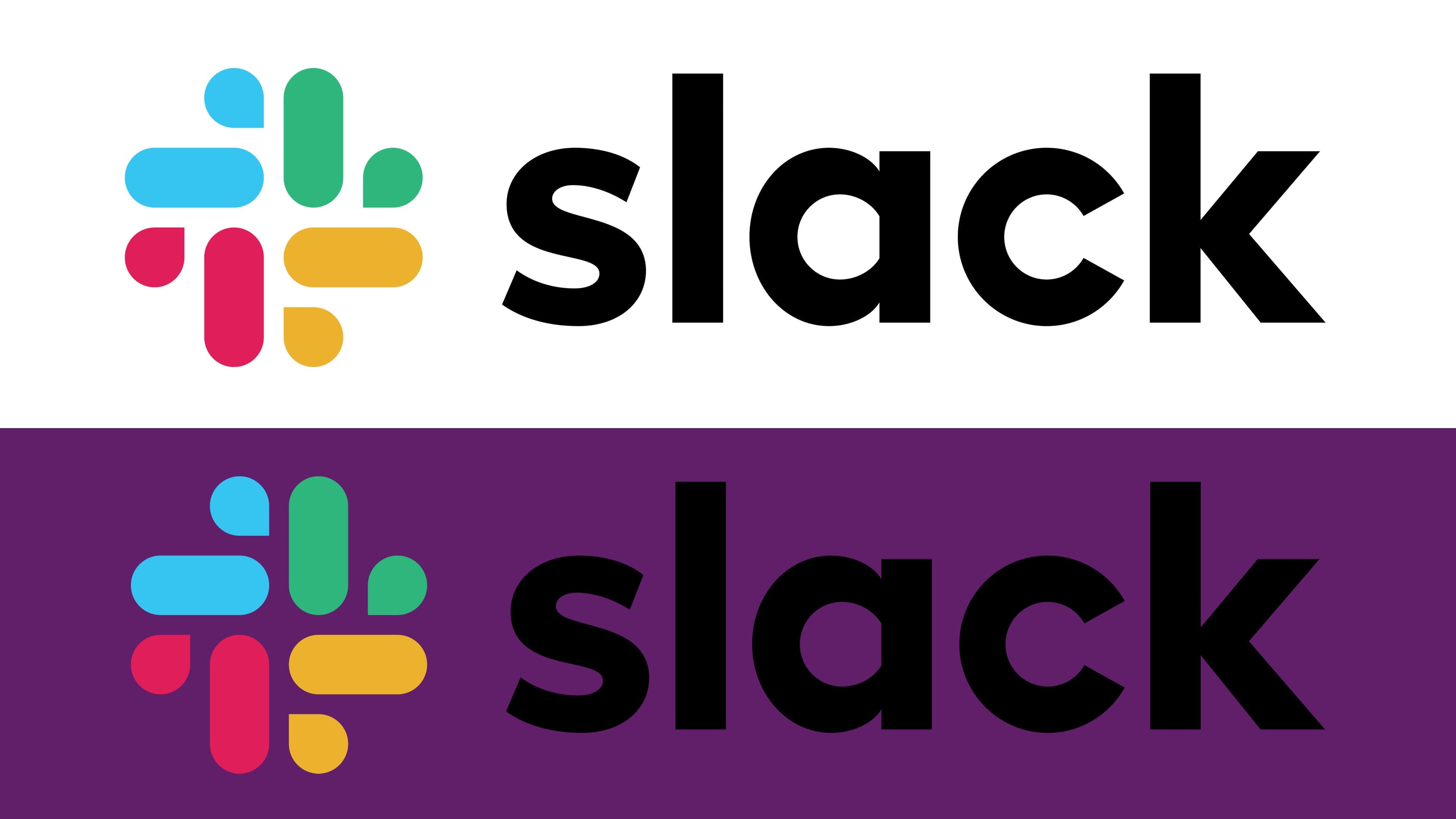
The simplified palette includes four colors instead of eleven: red (#E01E5A), green (#2EB67D), yellow (#ECB22E), and blue (#36C5F0). The shades have been improved to look great on screen. Also, the emblem has two more colors: black for the inscription and white for the background.
FAQ
What is the Slack icon?
The Slack icon is important to the brand’s desktop and mobile app identity. This icon helps members identify their workspace or Enterprise Grid organization. Users can upload a custom icon to make their workspace unique and recognizable.
Open the desktop app to update the icons for the Free, Pro, Business+, and Enterprise Grid plans. Click on your workspace name in the sidebar to access settings. Upload an image to serve as your workspace icon.
The icon personalizes the workspace and helps members quickly find and differentiate between multiple workspaces. This feature enhances the user experience by providing a visual cue that aligns with the workspace’s branding.
What font is the Slack logo?
The logo uses the Hellix Bold font and features an octothorpe (a hashtag). This combination creates a unique and recognizable look for the brand.
Hellix Bold makes the logo look modern and professional, aligning with Slack’s image as a leading communication platform. The octothorpe symbolizes connectivity and communication, which are key aspects of the brand.
Using Hellix Bold makes the logo clear and impactful, helping it stand out across different platforms and devices. This font choice ensures a strong and consistent brand presence, making it easily identifiable to users.
Why did Slack change its logo?
The brand changed its logo because the old one had major design flaws. The previous logo looked bad on backgrounds other than white, making it hard to use in different situations.
Another issue was the multi-colored hashtag. When rotated at any angle other than 18 degrees, it didn’t look right and caused problems for the development team.
To fix these issues, the brand introduced a new logo. The new design is more adaptable and looks better on different backgrounds, making it more practical and user-friendly. The new logo is simpler, more consistent, and easier to recognize.
Is Slack a trademark?
Yes, the brand is a trademark owned by Slack Technologies, Inc. This trademark protects the brand’s name and logo, ensuring that only Slack Technologies, Inc. can use them for its products and services. This legal protection helps maintain the brand’s identity and reputation.
Trademark protection prevents others from using the name or logo in a way that might confuse consumers or harm the brand’s image. If another company tried to use a similar name or logo, it could mislead people into thinking they are using products or services that might not meet the same standards.
Having a registered trademark supports marketing and branding efforts. It reassures customers that they are using authentic products, fostering trust and loyalty. It provides legal action if any entity infringes on the brand’s identity. This helps safeguard the brand’s quality and integrity, ensuring it remains distinct and recognizable in the market.
What is the Slack logo?
The logo consists of four rounded rectangles arranged in a turntable shape, with four drops in between. These elements are colored in pairs of blue, green, red, and orange. Next to this design, the word “slack” is written in black, creating a clear contrast. This combination of shapes and colors makes the logo recognizable and visually appealing.
When did the Slack logo change?
Slack’s logo was redesigned in January 2019. The old logo had visibility issues on different backgrounds and problems with the multi-colored hashtag. It only worked well on a white background, limiting its versatility.
The new logo features four rounded rectangles arranged in a turntable shape, with four drops in between. These elements are colored in pairs of blue, green, red, and orange. The word “slack” is written in black next to this design, creating a clean contrast. This new design is more adaptable and consistent, making it easier to use across different platforms.
The redesign aimed to create a logo that is instantly recognizable and effective in all contexts. The updated logo helps the brand maintain a strong and consistent presence, making it easily identifiable to users everywhere.