In the light of recent economic events, SMART Global Holdings became one of the companies that decided to renew their identity and make an easy rebranding. According to the idea of the initiators, the new image will be more in line with modern service requirements and will better reflect the role of the entire “family” of the brand.
The California-based company specializes in designing and manufacturing computing electronics, memory, and specialized LED solutions. This fairly technological brand has big ambitions in the market and is considered a major leader in the industry, so there is no way to lower the bar.
Rebranding is just a stage in improving the company’s performance. This is not a destructive cataclysm, not a raging ocean of change or radical changes in strategy. It is consistent work on quality, appearance, and systemic processes that ensure the effective operation of the brand. At first, it isn’t easy to rebuild, but with the appearance of the first reviews, new customers, and an increase in profits, the entire path traveled becomes clear and indicates success.
Energy, ingenuity, passion for work – this is what lies in the new concept of the SGH brand. The abbreviated name and the unpretentious logo, consisting of only three white letters on a delicate menthol background, do not give the impression of a huge holding. Due to massive fonts and basic familiar colors, the scale and solidity are not always transmitted to the target audience.
This new approach aims to provide the brand with new horizons, present perspectives, and help unleash the potential in different dimensions.
As for the font, it is not as simple as it seems at first glance. The principle of contour strokes and construction of type using straight lines works differently here. The letters G and H look ultra-modern and elegant because they have negative space in their graphic design that adds flavor.
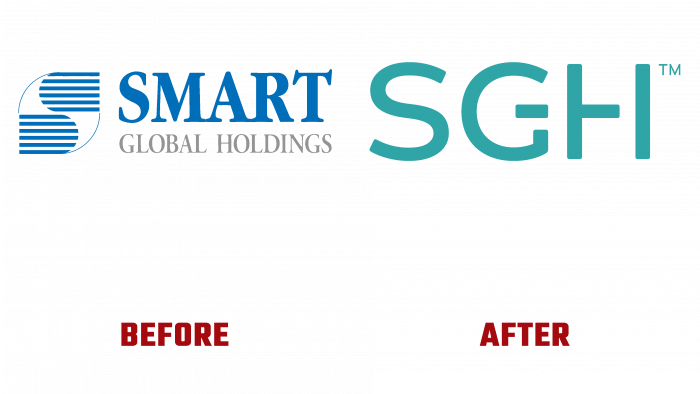
Previously, the font was sky blue; the caption below was in a light gray tint. Serif, not tech, not innovative. A font like this might work for a simple news publisher. There was an interesting icon that stood for the letter S and was built thanks to lines and stretched cropped ovals. The two halves looked in different directions, forming two halves on the same axis and a thin outline.
The new logo looks modern and adequate to the new strategic objectives. Therefore, other brands should pay attention to an emerging competitor who will soon take high leadership positions and attract a large audience. Therefore, rebranding in time means contributing to the development of the future and the achievement of the brand’s success at a specific moment, distant in time, when the public will appreciate the new design.


