A warm heart and excitement should always be combined with unshakable principles and a sober look. The Societe Generale logo combines these two ideas. The emblem shows that the bank guarantees the safety of funds and a decent profit when investing money.
Societe Generale: Brand overview
| Founded: | May 4, 1864 |
| Headquarters: | Paris, France |
| Website: | societegenerale.com |
Societe Generale is a globally systemically important bank from France that provides universal services since its extensive investment and financial structure. Its second name is SocGen, short for the main one. It has many branches both at home and abroad. In terms of assets, it is the third French bank and the seventh European one. He is part of the so-called Trois Vieilles, heading the French banking system along with Crédit Lyonnais and BNP Paribas. Moreover, the financial institution has very long roots, dating back to the 19th century, in the 1864th year. Now its headquarters is located in La Defense near Paris – in a skyscraper called Tours Société Générale and located in the business district.
The bank appeared under a different logo and a different name. Those that are now known arose much later. Its first name is very long – General Company to Support the Development of Commerce and Industry in France. It was a specialized company established by a group of financiers and industrialists in an important historical period – the Second Empire.
At first, she actively opened offices and staffed the staff with qualified personnel. Gradually, it acquired a wide network of financial outlets: 15 in Paris and 32 in the country. Now there are much more of the – hundreds of them. Moreover, they are located not only within the country but also abroad: in Asia, Europe, South America, Africa.
Since 1894, credit departments have appeared in the structure of the financial organization. In 1945, the bank was nationalized, so it became subordinate to the state, becoming its sole shareholder. Over the years, the organization has repeatedly flourished and experienced a decline but did not leave the banking market, keeping the same logo.
The bank’s most recent loss was € 1.26 billion, which it suffered in mid-2020. As a result, serious administrative changes were outlined. They will show themselves by the end of 2021 and will probably affect the bank’s identity. And it has not changed for a very long time: the investment and financial conglomerate has only one emblem. After moving its headquarters from an old building in Paris to a special business district of La Défense, it gained a high profile, built up with skyscrapers.
Meaning and History
For the sixth largest bank in Europe, the most important thing is reliability and stability so that it can continue to be the flagship of the international financial system. Therefore, its logo is completely subordinate to this concept: it is massive and square, with equally even sides. So he demonstrates the firmness of the French financial and investment service and resistance to any external influences. Now its branches worldwide are recognizable by a red and black sign with a white center.
The company has been in existence since 1864, so its visual identity is subconsciously linked to the historical roots through which it has grown and developed. If we draw a parallel, we can see a clear similarity between the emblem of Societe Generale and its first Paris office. He was on the Rue Provence in a building of the same massive and square shape. The colors are different, of course, as the bank tried to combine brightness with its iconic lines of business. Moreover, he began work with a different emblem and with a different name – General Company to Support the Development of Commerce and Industry in France. But after the rebranding, they have changed. Today it has two modern logos.
What is Societe Generale?
Societe Generale, also known as SocGen, is a major French bank considered to be systemically important. It offers a vast array of services, including trading in securities and issuing shares and bonds. Its history dates back to 1864 when a group of financiers and business magnates decided to create their own credit and financial institution. Today, it is a multinational company represented in more than 60 countries.
1864 – 1990
During this period, the brand’s logo and emblem are unknown.
1990 – 2011
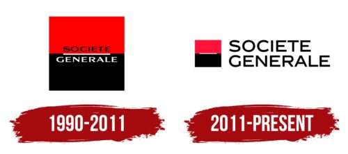
The result of the reformatting of the French bank was a change in visual identity. The management approved the option with a two-color square. It is divided into two equal halves: red top and black bottom. These segments contrast with each other and look like two rectangles stacked together. The colors in them are saturated and bright, close to peak shades – scarlet and coal. Between them is a thin white stripe in the center – horizontal and even. Its function is to separate not only the top and bottom but also the two-level name of the bank. The first word is located on a red background, so it is colored black. The second part is on the dark side of the logo and is white for better readability. The inscription is typed in bold antiqua with flattened letters.
2011 – today
The modern emblem is an improved version of the old logo. It retains a two-color square with a visual division into two halves. However, crimson is now used instead of bright red. It is just as catchy but looks softer without causing unpleasant associations among customers. The designers kept the white stripe and slightly enlarged it. They moved the name of the financial and investment institution outside the icon, making it a text part. But the old font disappeared: the place of a wide antiqua was taken by an expressive grotesque. The inscription is typed in capital bold black letters. The two-tier arrangement remains, but there is now left alignment, while the words were centered before.
Societe Generale: Interesting Facts
Societe Generale, or SocGen, is a big European financial group that started in 1864. It has helped France’s economy grow and has spread its business all around the world.
- Beginning and Goal: It began on May 4, 1864, thanks to Henri Ardant and some businessmen with government support. Their goal was to boost France’s trade and industry, which has guided the bank’s actions over time.
- Innovative Start: It pioneered checking accounts in France, changing how businesses handled money.
- Going Global: SocGen didn’t wait long to go international, opening its first overseas branch in London in 1871. Now, it operates in over 60 countries.
- War Support: SocGen played a crucial role in World War I by helping fund France’s military efforts through bond issues.
- Wide Range of Services: Today, SocGen offers many financial services like retail and corporate banking, asset management, insurance, and more for different customers.
- Leading in Green Finance: The bank is at the forefront of sustainable finance, issuing green bonds and creating financial products for eco-friendly projects.
- Key Purchases: SocGen has grown by buying other companies, like Crédit du Nord in 1997 and Rosbank in 2006.
- Trading Scandal: In 2008, the industry was hit by a huge scandal when trader Jerome Kerviel’s unauthorized trading caused a nearly €4.9 billion loss, leading to tighter risk management.
- Culture and Sports Support: SocGen supports culture and sports, especially rugby in France, and sponsors art and music events.
- Tech Innovation: It’s keen on using technology to improve banking through digital platforms, mobile apps, and blockchain projects.
SocGen’s evolution from a French banking trailblazer to a major player in global finance shows its ability to adapt and innovate. It has significantly contributed to economic growth, sustainable finance, and community support.
Font and Colors
The current logo echoes the appearance of the skyscrapers where the bank is located. Tours Societe Generale (this is the name for two buildings built in a half-turn towards each other) is repeated in the graphic icon’s outlines. It shows two horizontal rectangles with miniature protrusions on the right and left. The upper zone is red; the lower one is black. They are connected to form a void in the middle, which is conveyed by a long white line. All these contours are recognizable in the financial conglomerate’s head office buildings; there is even a narrow space between them.
The combination of contrasting tones reflects strength and influence, and a strict geometric shape conveys the company’s energy and power. On the right is the bank’s name, grouped into two lines: in the upper row – “Societe,” in the lower – “Generale.” All letters are standard, proportional, capitalized, grotesque and subtle. Both elements are located on a white background.
The logo is written in a typeface reminiscent of Media Gothic. These are narrow sans serif letters, geometrically strict and even. They demonstrate the transparency of the conglomerate’s financial activities and its openness to clients. The proprietary palette is stable and includes three colors: red # e50a30, black # 010101, and neutral white.
Societe Generale color codes
| Red | Hex color: | #ee1337 |
|---|---|---|
| RGB: | 238 19 55 | |
| CMYK: | 0 92 77 7 | |
| Pantone: | PMS 185 C |
| Black | Hex color: | #000000 |
|---|---|---|
| RGB: | 0 0 0 | |
| CMYK: | 0 0 0 100 | |
| Pantone: | PMS Process Black C |
