


![]()
The Society of American Foresters (SAF), a key organization in forest management and conservation, has introduced a refreshed brand identity as it approaches its 125th anniversary. Created with the design agency Bullhorn, the rebrand reflects SAF’s mission to honor its rich history while staying connected to modern audiences and future challenges.
The old logo featured a square design with overlapping silhouettes of trees and bold white initials. While it is tied to forestry, the layered design made it hard to read, especially on digital platforms. The heavy use of green emphasized its connection to nature but didn’t offer much contrast, limiting its versatility across different media.
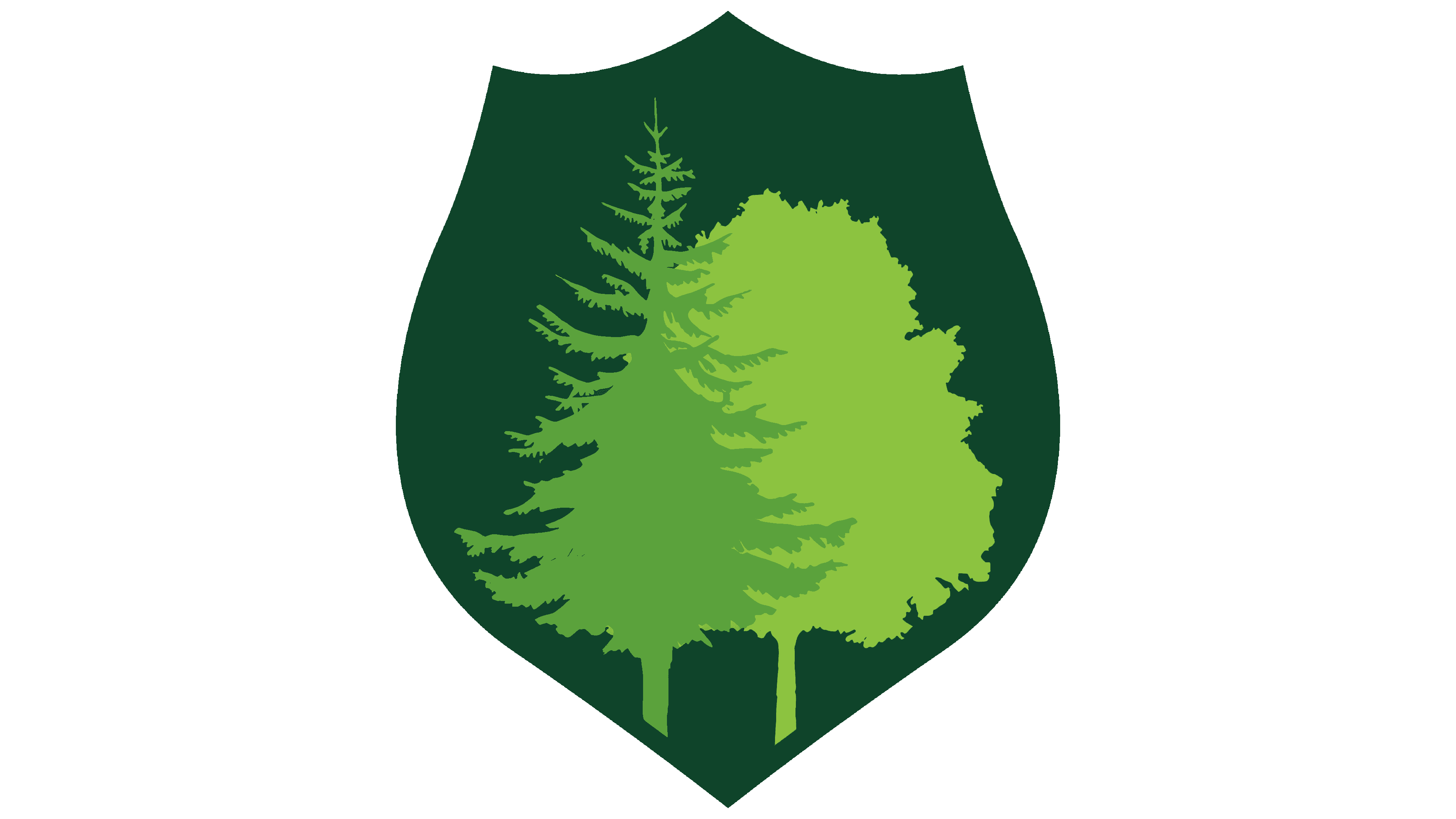
The new shield-shaped emblem represents protection, resilience, and the responsibility of caring for forests—values central to sustainable forestry. The design adds a sense of authority and reliability, reflecting the organization’s education, research, and advocacy leadership. It signals a role in safeguarding forest ecosystems while promoting sustainable practices within the industry.
![]()
Inside the shield are two stylized trees in different shapes and shades of green. These trees represent the diversity of forest ecosystems and the broad range of people and practices within the forestry community. The clean, modern lines keep the design simple yet meaningful. The contrast between the darker and lighter greens adds a sense of depth, much like looking at the layers of a forest canopy.
The bold, sans-serif initials font sits at the shield’s center. The new typography is clean and strong, enhancing readability while reflecting professionalism. The clear, geometric letters stand out against the green background, making the logo easily recognizable on a printed report or a website.
![]()
A key part of the rebrand is a flexible system that supports regional chapters. Each division can feature tree species specific to its area while keeping a consistent look with the overall brand. Local groups can showcase what makes them unique while staying connected to the larger identity, helping members feel represented and part of a national community.
The color palette goes beyond traditional greens. Subtle variations are mixed with neutral tones, giving the brand flexibility across different materials while maintaining a strong link to nature. This wider range of colors helps create contrast, making the design adaptable for professional reports and more casual content.
The redesign wasn’t done in isolation. The organization engaged its leadership and members through focus groups and surveys to ensure the new look reflected its values and vision. The updated identity feels timeless and fresh by involving its community and drawing from historical roots.
The updated design shapes how the organization presents itself, from educational resources and event signage to digital platforms and branded merchandise. The cohesive system ensures that the brand feels familiar and authentic no matter where people encounter it.