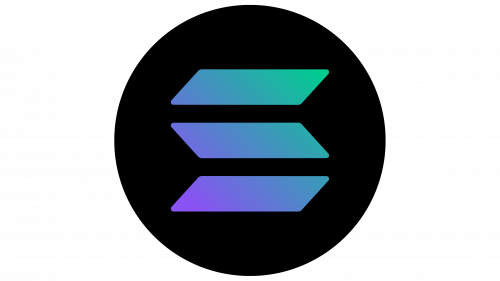
The unusual logo of Solana displays the typical structure of a blockchain platform and the principle of the cryptocurrency belonging to it. Together, they form a complete concept known in the circles of digital coin holders. To attract more attention, the currency unit is presented in vivid and contrasting colors.
Solana: Brand overview
Meaning and History
The first to appear was the company Solana. Two years later, it launched a blockchain platform of the same name to support its decentralized applications. To ensure optimal functioning, it, in turn, announced the release of its cryptocurrency, which received the abbreviated designation SOL on the exchange, becoming an alternative to Ethereum. Despite the large number of similar names, there is only one logo, adopted in 2020, simultaneously with the emergence of the blockchain. It is colorful enough to attract attention and incredibly restrained to show a businesslike spirit.
What is Solana?
Solana is a blockchain platform, its electronic currency, and the company that owns it. The digital platform appeared in 2020, two years after the founding of Solana Labs by two entrepreneurs – Anatoly Yakovenko and Raj Gokal. The website was launched to support smart contracts (its decentralized applications).
2020 – today
The main feature of the Solana logo is its recognizability. Its basis is a black circle, reminiscent of a mysterious coin. The coin seems mysterious because of its deep color. It is so saturated that it looks coal-anthracite – extra black with a slightly shiny surface. Inside the disc are three geometric figures placed at equal distances from the edge. These are parallelograms. Thanks to their horizontal-mirror arrangement, they have the form of a folding screen, as they are perceived as separate parts of a whole structure.
The first and third elements have an extended upper right corner, and the second one has a lower corner. Moreover, they are not sharp but slightly rounded, emphasizing the safety of the cryptocurrency and the operations conducted with it. The plates are painted in a purple-azure gradient, smoothly transitioning from one shade to another: lilac, light blue, turquoise, lapis lazuli. Such harmony is calming and adds confidence.
Font and Colors
The Solana logo does not have a name or individual letters because the sign is purely graphic, with an emphasis on drawn elements. However, its color palette is diverse and gradient, with a smooth transition of shades. The darkest is purple, and the lightest is azure. Thanks to the high contrast, they look wonderful on a black background.


