Portuguese multinational and multidisciplinary brand Sonae from Maia has announced a change in its visual identity. It is an amalgamation of several companies operating in various fields – retail and financial, technology and telecommunications, offering franchise services. It also includes a chain of shopping centers. Today, Sonae is the largest employer, providing more than 50,000 jobs. Throughout its history, the group has evolved and expanded its offerings, improving the conditions of interaction with consumers, striving to meet the requirements of today’s day.
The visualization change process was preceded by a phase of in-depth analytics, quantitative research, and an extensive employee and user survey. As a result, we got an accurate picture of the situation in all areas of the business, the existing problems of employees, which created the prerequisites for creating a very strong alliance for interaction. Thanks to the help of specialists and industry experts, it was possible to formulate the main prospects in the development and evaluation of existing results.
Based on the process, designers created an effective set of principles and attributes of the brand, building a roadmap of further actions and organizational decisions that determine how to achieve the business objectives. The visualization is built in strict accordance with the slogan adopted by the brand – “We create today, a better tomorrow for all,” which interprets everything that was created to renew the identity as a consequence of the adopted new strategy. The slogan summarizes the defining forward-looking ambitions that characterize the entire group’s foresight, entrepreneurial spirit, and social responsibility and its sub-holdings.
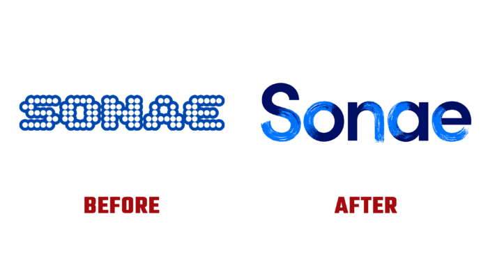
When creating the new logo, all the main historical values of the company were preserved based on the existing heritage. But its updated version demonstrates a change in tactical actions. A spectacular combination of graphic elements – brushstroke and vector design of text blocks allowed to reflect the duality of the human community, which seeks to improve performance and strict compliance with its obligations. The sub-brand logos also retain the focus set by the main logo. But thanks to their vibrant color palette, they have become the owners of a unique personality and unified composition. The whole design system aims to create optimal conditions for the organization of brand expression through convenient communications and marketing techniques. Fonts, icons, colors, images – everything works together to form a new expression for Sonae.


