The main objective of the Sook electronic resource is to provide users with free physical space for various purposes. This space can be used by tenants at their discretion, allowing them to realize their ideas with minimal loss of time searching for premises and processing documents for them in various areas of London or Oxford, Liverpool or Edinburgh, in Gateshead or Cambridge. All that is needed for this is the availability of access to the pages of the resource, a member of the community of which you can become in advance. With the help of Sook, it becomes easy and simple to demonstrate your abilities and capabilities to the world, including by uniting members of your community around what they like.
The brand offers access to its offers on the terms of the user. Here it is possible to choose a temporary space that will allow you to hold a one-time event, a conference room equipped with the latest technology. Reservations are made only for what is needed, for a specific time, and for the required period. There is no need to arrange a long lease, premises where expensive finishing is required. Sook makes every step of this process easy and flexible using handy apps like Canva. Applications expand the functionality, make it easy and simple to create the required project, apply the required furniture package, the cost of which is included in the booking amount. At the same time, the service provides full transparency of costs.
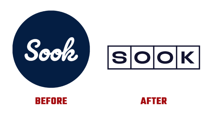
To more fully reflect the features and purpose of the brand, its visual identity has been revised. The new logo is a series of horizontally arranged squares, which symbolically connects the image with a schematic representation of the layout of indoor spaces. Each sector is filled with a letter from the brand name, which forms the overall composition of the logo. The sectors are of the same size, demonstrating the equivalence of each room in terms of usefulness and effective readiness for use immediately after their choice by the client. The black color, which is a corporate color, highlights the borders of the squares and is used to display the text block.
The logo itself is simple and concise, making it easy to remember and read in combination with various illustrations and color images. Being especially effective for creating contrasting compositions, color favorably highlights each element of the new visualization, emphasizing the ease of use of the resource, the absence of hidden costs, and additional complexities.


