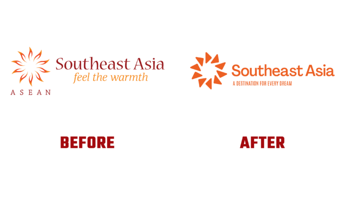
One of the main activities of ASEAN – the Association of Southeast Asian countries is tourism. This sector has been developing since 1977 when the Trade and Tourism Committee was established under the jurisdiction of the ministers of economy of the countries. In 1981, all states established the Tourism Forum – ATF as a common direction. At the same time, tourism develops in parallel with the organization itself, grows, and expands. The huge role of this direction in the association’s economy has made its adjustments to the popularization of domestic trips, expanding their number and ensuring the competitive viability of this type of industry. The updated brand visualization has become a visual reflection of the brand strategy, changes taking place in it, and a demonstration of the growth and importance of ASEAN TOURISM.
The new logo and slogan, Destination For Every Dream, was meant to capture the warmth and resilience, fun, and adventure that characterize the region’s peoples. The visualization brings together all the efforts made in this direction, raising awareness of the variety of proposals available. With their help, it becomes possible to easily and rediscover all those previously available boundaries in a completely different light, from a completely different side.
The logo resulted from a fruitful collaboration with the design studio ELMNTL. Its main task was to create an attractive atmosphere through which travelers could discover a world of multiple unique experiences, from the most unexpected proposals of the Commonwealth countries. The logo favorably emphasized the changes and contributions that each country makes to tourism development. This is provided by the graphic design of the main sign, which is a wheel of 10 stylized spokes, each of which represents one of the ASEAN members. Circle – symbolizes the harmonious balance that the Sun itself provides. The sign represents a modern view of the Sun, symbolizing vitality and constant renewal, creating a sense of constant visual movement, the driving force of which is drawn from unity. At the same time, it is a way to communicate the region’s aspirations for its future.
The corporate orange color has also been updated, which has acquired brightness and saturation. It has become more attractive, instilling in people a sense of energy experienced by travelers visiting the region. New fonts were used in the logo and slogan. He is very friendly and hospitable. The slogan itself reflects the main concept of the brand – providing a wide variety of travel and opportunities to visit many historical attractions.


