“Connecting the Dots” – the company’s motto after the rebranding.
Straive is a company that specializes in several areas: information technology, Ed-Tech interactive training, data processing, and complex solutions for various fields. The brand has partnered with such giants as Sony and Boeing. Straive’s customer base spans 30 countries, with strategic hubs spread across eight countries, headquartered in Singapore.
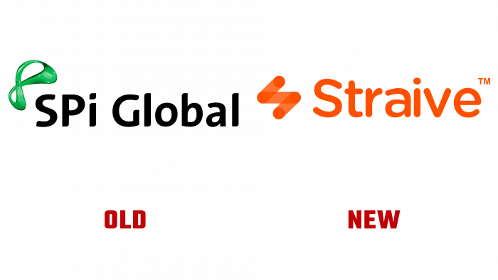
The rebranding implies the use of the new name Straive. The company completely changed the color palette and added bright yellows and oranges. The Straive logo features a stylized “S” created by connecting four dots.
According to representatives of the company, with the help of their services, specialists manage to connect the dots and find complex solutions. The lines connecting the points are shown in white or orange with a semi-transparent fill. Thus, the company displays the transparency of all processes, which increases customer confidence.
In addition to the new name and logo, Straive has created a website and added a beautiful 1-minute video to the home page. Signature colors can also be found on social media. The need for rebranding is explained by the fact that the company has been building up its power for several years, intensively developing and evolving. Thanks to the updated visual identity, it will be possible not only to increase awareness but also to show the desire for further development and solve critical problems.


