Equality is the main idea of a small rebranding of the company.
It is difficult for brands to stay afloat during a pandemic. The closure of stores or other outlets has severely lowered revenue and forced small businesses to shut down. Another challenge from the future is to bring customers back to their stores and re-show what exactly you deserve their attention.
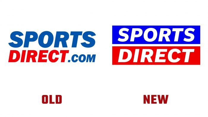
Rebranding is a great way to remind or make yourself known. Sports Direct decided to focus on pressing social issues: inclusiveness and equity. The “venturethree” design team drew a parallel with the equal sign for styling the logo. Two horizontal lines in blue and red represent the background for the Sport Direct name. The inscription is in bold and white.
Also, as part of the rebranding, posters were created with different color variations of the equal sign and Sport Direct products. A laconic logo fully reflects its aspiration, but the brand does not always adhere to its values. Sports Direct has been repeatedly involved in scandals with low wages and poor working conditions.
So, recently, information surfaced that employees receive salaries below the minimum limit. Also, several problems were supplemented by poor working conditions in warehouses, sexual harassment, and even a statement was received that one of the employees had to give birth in the toilet. Also, some employees were forced to go to the robot during a pandemic and quarantine secretly.
The serious topic that the company has raised does not match their vision and way of working. The logo did not arouse controversial comments from customers, but internal issues need to be resolved by the management to avoid negativity towards Sports Direct.


