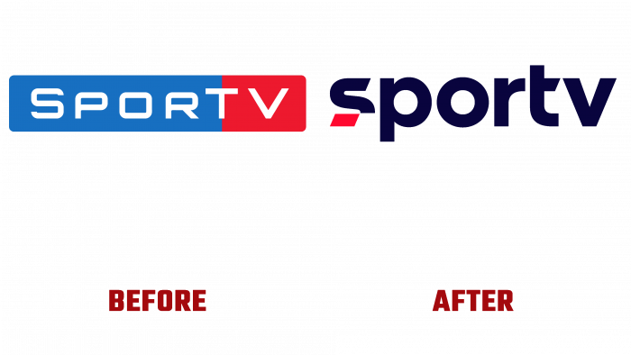
The sports multi-platform brand SporTV is celebrating 30 years on the air today, activating new additions to the main channel. Having chosen strength, dynamism, and impact as its pillars, the brand confidently moves into the future. Staying true to modern trends, the company keeps up with the times, making fundamental changes in its own visual identity, which was timed to coincide with its anniversary. External visualization has become more vivid, unexpected, and human. The entire thirty years of experience in the sports field was used for its implementation. In doing so, emphasis was placed on a new multi-disciplinary strategy at the heart of Globo direct selling when using “globoplay” in streaming.
As a result of these changes, SporTV has become the owner of new attributes that emphasize the main directions of the renewed strategy, reflecting strength, influence, and dynamism. Considering that the previous logo has a 30-year history, making changes to it required a very delicate approach. As a result, a concept was created based on the past of the logo but rethought in a modern interpretation. The main emphasis in the logo is on the letter S, which will become the channel’s monogram where the space for visual information will be especially limited. Its execution in white and red, where part of the lower sector has a visual separation from the base and an end painted in red, is the accent that attracts and makes such graphics memorable and recognizable.
A “soft” but “confident” sans-serif font was used to provide a spectacular impact on the viewer, which attracts the eye with modern and harmonious execution. The absence of sharp corners directly echoes the smooth curves of sports tracks, running tracks, sports arenas, which makes the logo consistent with the spirit of the sports theme. The white color of the text against the background of a deep and rich dark blue “ethereal” shade, used as a substrate and filling of free space in the logo, ensures its clear visualization, creating conditions for the possibility of a comfortable and easy visual perception of each element of the composition, reading the text as in a printed and in digital transmission mode.
The new visualization provided a more expanded perception of the company. Now it is not just a TV channel but a full-fledged sports brand.


