Modern technologies have not bypassed the attention of amateur gardeners. British gardeners today make extensive use of the modern online platform Sproutl, whose task is to reveal the secrets of gardening, making it even more accessible and exciting. The brand cooperates with a network of stores and garden centers, nurseries, and garden tools and fertilizers manufacturers. To increase interest in the resource, expand the reach of users and inspire a new audience, even those that had not planted or grown anything before, the founders of the brand put a lot of work and creative inspiration. A new attractive identity was created, which promised a lot both to those who have more than one hundred square meters of their garden land and those who are just the owner of a tiny balcony in the city. Sproutl is committed to making gardening fun and engaging, no matter how big or small. The designers of the London-based company OMSE helped to do this by creating a modern and attractive garden brand identity, creating all the conditions for its growth and development.
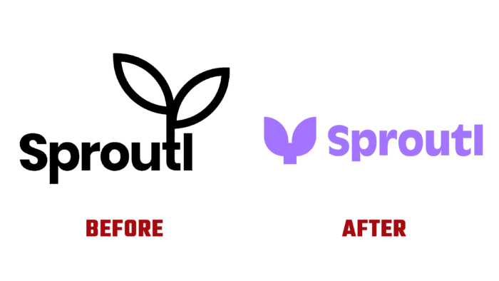
Taking the very name of the resource as a basis, the designers developed the main symbol of the brand, which can be easily transformed into a variety of products offered by the site—starting from beautiful indoor and garden flowers to various shrubs and ornamental fruit trees. The minimalism of the new logo made it easy to read. It represents an idea – a sprout and its coming rebirth, transforming a small into a large and beautiful plant. This was achieved without reflecting the detailed anatomy of plants and visual transmission of the details of their growth process.
To enhance the effect of the icon on the viewer, a charming animation of a sprout that sprouts from the ground opens and gives impetus to the growth of something else was applied. Thus, the symbolism of the direct interconnection of everything that Sproutl represents was created, confirming the brand’s commitment to supporting continuous growth. The composition is complemented and completed in its original font – Antique Olive by URW Type Foundry, distinguished by a close fit and strong clamps. Here it directly echoes the peculiarity of the brand’s professional profile. The capital letters of the font look like sprouts. A great combination of icons and text contributes to this impression. A well-chosen size ratio enhances the effect.
Users can choose their avatar from the presented set. In this case, the icon is amenable to user settings. A thoughtful set of growing illustrations help reduce the dryness and “boring” of professional information and instructions. Echoing the main language of the website design, the illustrations effectively support and focus on the brand’s main idea.


