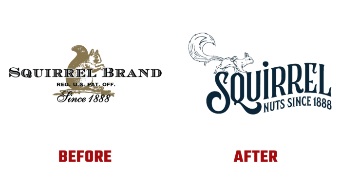
In 1888, in the USA in Roxbury, Massachusetts, a company was founded to sell mixed varieties of nuts – the Squirrel Brand Company, which were delivered to Boston stores using horse-drawn vehicles. In 1999, the company was acquired by Southern Style Nuts. In 2017, another important change took place. The brand became the property of John B. Sanfilippo & Son, Inc. – the largest industrial association. As a result, Squirrel Brand was relaunched as a revitalized direct-to-consumer company, offering a simpler and more in-demand range of sweet and savory nuts. The change necessitated a change in the brand’s visual identity, with the logo and new identity designed by the British-American company Straight Forward Design.
In the conditions of modern reality, when cardinal changes are taking place in society, associated with a new perception of the surrounding reality and the processing of the information received, visualization requires a special approach to its development. Difficulties were added by the high density of filling this market and the global pandemic. A complete rethinking of the brand was carried out, which made it possible to create a new identity that ensured recognition and full compliance with the requirements of the time. The update glorified the nut with the help of an updated historical character – a squirrel, which received a name. Its name, Zip, refers the viewer to the famous product, Squirrel Nut Zippers, closely tying the visualization to the company’s vast backstory. Cheerful and dynamic squirrel, constantly in search of the best nuts and supplements, attracts with her charm and restlessness. It moves freely throughout the art deco logo, never appearing in the same place twice.
The original design approach to creating the logo was based on the use of a charming compressed vintage serif typeface and a lot of ornamental elements. Its placement along a thin arch and along a full curve, with an accurate reflection of all its changes in curvature, makes it recognizable and easy to read. The applied font has a showy and pronounced individuality
The character’s image is distinguished by natural liveliness, which is ensured by the lack of solidity and geometric correctness of the figure. The original combination of two elements from different eras – an old-style font, many drawings made using iconographic methods, and a modern image of a squirrel makes the logo and the entire visual identity unique and distinctive. At the same time, the designers provided a spectacular demonstration of the connection between the past and the present of the brand while maintaining respect for its rich heritage, forming a virtually new composition filled with the spirit of a successful past, which helps open up new opportunities for the future development of the brand.


