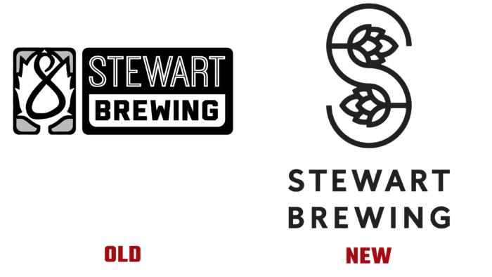
Rebranding of craft brewery from O Street design studio in Glasgow highlighted the brand’s Scottish heritage.
The brewery has Scottish roots, and it was this nuance that inspired the tartan designers, a graphic checkered pattern. The new logo retained the shape of the hops but transformed the company’s S-shaped mark. Thus, the designers have preserved the traditions and showed the modern trends in the brewery’s growth.
The studio also designed a new packaging template for a brewery near Edinburgh.
The main goal of the rebranding is to unite all the beers of the Stewart Brewing brand and contribute to its growth in the domestic market due to the identification and uniqueness of the offer.
The idea of the specialists was to create a logo in a monochromatic style so that it contrasts with the complex patterns on the packaging. As for the patterns themselves, they are made in two rows by superimposing multi-colored stripes on top of each other. The result is a simple two-layer system but with a rather intricate tartan. The previous colors were used for the coloring to preserve the tradition of the brand. And added shades associated with each type of beer – at the suggestion of Stewart Brewing.
The use of a traditional color scheme retained the feeling that the brand was well known. The previous design consisted of a series of labels with separate shades (about six) for each variety.
This pattern is used on vehicles that deliver products to shops. He also adorns the sign of the brewery itself. The designers used the Buenos Aires font. Thanks to the graphic features of some of the letters, this font infuses the brand with a sense of warmth and closeness in spirit.


