Stitzlein Studio’s visualization of the new Seal storage system provided an insight into the benefits of decentralization, power, and flexibility. Innovation requires clarity and clarity of understanding, especially for non-specialists but potential users. This is ensured in several stages, the first of which is the external design, visual identity. The success of the development of any startup directly depends on the ability to present the very idea in an attractive and accessible way, which the Stitzlein studio succeeded in popularizing this brand.
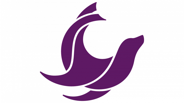
The word Seal, chosen as the name, has a double meaning. It is a seal and a seal. The Stitzlein studio built its work on this. The formation of the brand’s style was based on the peculiarities of the animals’ movement. Seals look clumsy on land, ponderous, funny, and slow. Their image always suggests a circus. But in the water, they are real lions. Amazing mobility, sharp turns at incredible speed contribute to a successful hunt. By observing them in this process, it becomes possible to enjoy grace, unsurpassed flexibility. And it is precisely these properties that are characteristic of decentralized networks – cryptocurrencies, blockchain, which made the Seal the best reflection of the platform’s features, its most accurate and informational symbol.
Creating the logo included graphics based on the rules of maintaining the proportions and symmetry of the circles. The mark in the form of a somersault seal uses the intersection of circles of different sizes. This made the symbol built of many elements that have smooth and regular curves in their design, which is characteristic of the principles and philosophy of the brand. This monochromatic sign has been used on all visualization and image products, representing the brand very effectively and concisely.
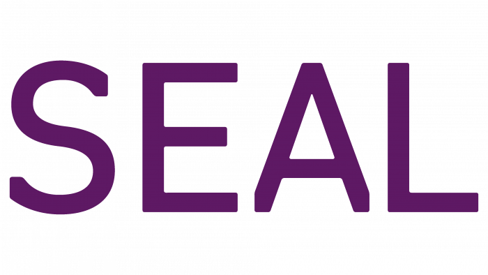
In addition to the mark, the logo itself includes the text – the brand name, made in capital letters. However, the timeline for the execution of the text raised many questions. Suppose the cutting of the lower extremities of the right and left legs of the letter “A” can be explained by the construction technology using circles. In that case, the arbitrary attitude to curling is difficult to explain. Failure to maintain the uniformity of the spacing between letters creates a visual “disorder.” This is especially noticeable in the letter “S.” Perhaps this is how the designers sought to reflect the predominant decentralization of the brand. However, the resulting visual impact is not a very pleasant sensation.


