White Bear helped design a new style for the Stribe app to help build more engaged and motivated teams. With its help, the management can unite the team of its enterprise, get an analysis of the interest in the employee’s work, find out his problems and wishes for improving the activity or the surrounding atmosphere. The application has undergone some changes in its functionality during its existence, it has become more understandable and efficient, and some bugs have been fixed.
The application developers reflected the users’ wishes in the updated version. Changes in the formation of new jobs, the requirements for creating appropriate working conditions have led to the need to keep up with the times and the accompanying means for this. All this required making adjustments to the own visualization of the service, reflecting its update and making it more understandable and modern. The updated Stribe listens to every user and provides instant and effective feedback. An analysis based on pulse control, the definition of key phrases, makes it possible to analyze the state of the employee and the study of his wishes and ideas for improving work.
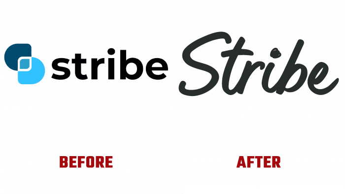
White Bear’s designers have deeply studied all the features of Stribe to understand the main and important features of the application that distinguish it from a large number of players in the category of well-being and involvement in their work of employees of any organization. The previous version of visual identification did not meet the new requirements – a reflection of the cheerfulness and positivity of employees, their character and needs, and positive changes in the workplace that took place over a year and a half. The new visualization allows you to fully reveal all the application features, making it more attractive and understandable and primarily using the handwritten typeface used in the brand’s logo in black, contrasting with the yellow background. The tilt to the right is a symbolic transmission of the desire to move further and interact with people constantly.
The use of several dynamic characters made it possible to reflect all the feelings and emotions that employees experience and demonstrate in their activities. The chosen color palette facilitates this. The main brand becomes an energetic, bright yellow shade, which positively affects the human psyche and effectively raises the mood. The general dynamics and graphics of visual compositions aim to create a cheerful and friendly atmosphere, creating a sense of humanity, not only in relationships between people. At the same time, this approach did not limit the brand in the possibility of further development, leaving enough space for new changes.


