Coping with cancer is a complex process for the patient, their family and community, and all those involved in their medical care, therapy, and related care. The diagnosis poses a great risk, so getting more people involved is key to the positive effects of treatment and finding alternatives to maintaining a decent living standard.
Wales has a charity, Cancer Research Wales, that supports cancer research. The foundation develops technological solutions for patients to alleviate pain, relieve symptoms, support psychologically, and ensure the well-being of the patient’s family.
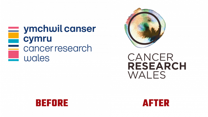
This foundation recently revamped its identity, which has received welcome support from the public.
The concept behind the redesign is based on changes in the DNA of a person with cancer. The brand’s DNA sequencing gel is used for lab staining when detecting genetic errors. For employees, it simplifies the process of analyzing genetic data. The artificial dyes in the gel inspired the palette for a future new brand identity.
It is emphasized that two aspects were decided to play up in the logo – the English spelling of the foundation’s name and the signature gel for DNA analysis. The Welsh name – Ymchwil Canser Cymru – is recognizable and associated with the charity but does not look clear to everyone, so they decided to duplicate the English equivalent.
Under the leadership of Professor John Moore and the trustees, more than £20 million was spent on cancer research. Unfortunately, this figure only comes close to the desired result – Wales has lower survival indices for common cancers than other countries with a similar health care system. An additional 300 lives are saved each year, and 600 people are the goal the brand would reach if the rates were closer to the European average.
With the change of the logo, the brand wants to increase its influence, draw attention to the problem of cancer research, and raise citizens’ awareness about the importance of early diagnosis.
The colors used in the logo are dark and light blue, delicate orange, coral, and white. All colors are banded together in a vertically standing rectangle, like an abstractionist’s canvas. But this is by no means a work of art, but the realities of many people’s lives that doctors and patients face. These are the very strips that mark genetic changes in cancer patients.
Today, the stripes, which highlight the dark blue descriptor with a pleasant soft font, are not just a graphic representation of the brand’s appearance, but also the hope for joy in the future, successful treatment, a new path to life, which the team of specialists from Cancer Research Wales is blazing for patients with its activities.


