Powerful implementation tools and solid brand positioning in the market have always been the key aspects of the company’s success. At the same time, modern design technologies, which are developing too quickly due to the conditions of competition in the creative space of mankind, make it possible to create unique visual masterpieces, both in advertising services and goods and for simple use in business, which then contributes to the growth of interest in it and expanding the brand as a whole.
So, therefore, it happened with our delirium, which we will consider in this article.
The healthcare industry, with its core message of “Be Healthy!” Has always been rich in brands and their products. It would seem how much is invented by designers to attract the attention of a potential buyer or user. But even in the case of everyday obtrusive advertising, a hackneyed image, or a symbol of medicine, health, and beauty, there is always a fund that will outshine other brands with its identity.
The Summit Medical Group has rebranded and changed its original name to Summit Health Cares. The sounding name has become louder, juicier, more fundamental, and larger. It speaks not only of the medical industry but also of the health-preserving concept in general. This is care, protection, provision of everything necessary for people who are not indifferent to themselves, loved ones, and stand up for a healthy person as a whole.
Initially, the foundation was based on the idea of affordable medical care for disadvantaged and low-income citizens. The growth stages of the brand have shown that expansion is needed. In 2013, when the foundation was first established, it immediately began to show positive statistics and feedback in the New Jersey community. In connection with the rebranding, the fund expanded its coverage geography, including the suburbs of New York, Central Oregon, with the districts providing top-level medical services.
The brand’s focus is a dedication to the ideal image of affordable medical care, the creation of a benevolent healthy society. Brand leadership emphasizes the need to develop four priority areas:
- Expanding opportunities to increase affordable and quality health care, health awareness.
- Ensuring the emotional, physical, spiritual well-being of cancer patients and their families increases the chances of recovery.
- Training healthcare professionals and graduates to optimize the continuity of the next generation of healthcare providers.
- Providing financial assistance and support to categories interested in a “healthy future” – students, patients, partners.
The brand’s activities during the covid pandemic gained particular importance.
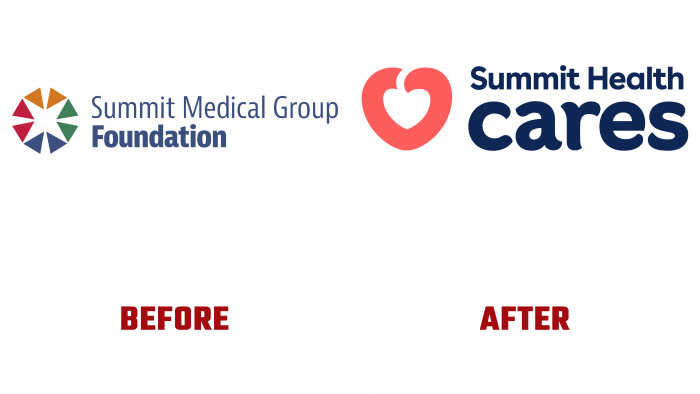
Analyzing the merger of the company into the large brand Summit Health Cares, it is worth noting that the logo created even earlier was bright, creative, and effective. It came in four different shades – orange, green, blue, and red. Composed of eight triangles, forming even more triangular pointed shapes, the graphic element has a white opening in the form of a quadrangular star in the center. It hints at a connection with medicine, brilliant quality of service, and comprehensive care. On the right was the Summit Medical Group descriptor, and below the foundation. Good emphasis on the brand’s business and the correct placement of all visual elements created a harmonious order and favorable impression.
The current logo is very modern. As global brands have simplified their designs lately, Summit Health Cares has gone the same way and decided to stylize the logo. Above, the descriptor with the name is tough, bold, and clumsy. The word CARES was made in capital letters and a special rounded serif font that resembles leaflets to convey caring participation and a respectful attitude towards customers. The letters seem to be drawn to each other; they want to hug their neighbor. It shows good communication, benevolence, and unity, which is reflected in the brand’s values.
An innovative rebranding solution is the use of a heart-berry, which is visible in the white gap against the background of the pale coral outline of the heart. The rounded shape of the icon and the matched color give an idea of the many associative symbols of medical care. This is the warm, caring heart of the staff; it is the vigor with which people are fighting for affordable medicine; also a berry, like fruit, like the personification of pleasant results of treatment, like a “cherry on the cake” of a simple service. You can play around and discuss this logo for a long time. The most important thing remains – the meaning of goodness, health, help, undoubtedly, confirm the deep mission of the brand and will further contribute to the development of this business for the benefit of people.


