The SunChips logo highlights the bright, crispy taste of the chips. The product lifts your spirits and is an excellent snack for relaxing. The emblem reflects the snack’s natural and safe qualities, made from wholesome grain ingredients.
SunChips: Brand overview
SunChips, brought to life by Frito-Lay in the late 1980s, emerged to satisfy a growing hunger for healthier snacks. The aim was to create a treat that merged the pleasure of chips with the nutritional goodness of whole grains.
By 1991, the brand officially entered the U.S. market, debuting with just the original flavor. Consumers quickly embraced its unique taste and texture, appreciating it as a wholesome alternative to traditional chips.
The brand’s popularity surged in the early years, prompting the company to introduce new flavors like French Onion and Ranch in 1995, enhancing the brand’s allure.
As the 2000s neared, the brand solidified its standing in the healthy snack category. The company continued to innovate, adding flavors such as Harvest Cheddar and Garden Salsa, which swiftly became favorites among consumers.
A significant chapter in the SunChips story unfolded in 2007 when the company began utilizing solar energy at their Modesto, California plant, where the snacks were produced. This initiative lessened the environmental impact, reinforcing the brand’s eco-friendly reputation.
2009, the brand unveiled a revolutionary development: the world’s first fully compostable snack packaging. This milestone attracted considerable media attention and resonated with environmentally conscious consumers.
An unexpected challenge arose in 2010. Consumers reported that the new eco-friendly packaging produced excessive noise when opened. This feedback led to the temporary withdrawal of compostable packaging for most flavors except the original.
The company persisted in its commitment to enhancing products and packaging. In 2013, the brand introduced the SunChips 6 Grain Medley line, highlighting a dedication to healthy eating.
In subsequent years, the brand expanded its offerings, launching flavors like Sweet Potato and Veggie Harvest, catering to consumers seeking diverse healthy snacks.
Meaning and History
What is SunChips?
It is a brand of multigrain chips produced by Frito-Lay. These chips are known for their unique wavy design and variety of flavors. They are made from a blend of whole grains, including corn, oats, wheat, and rice. Due to its whole grain content and lower fat, the product is positioned as a healthier alternative to traditional potato chips.
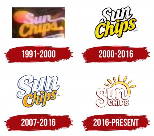
1991 – 2000
SunChips are a pleasure you want to experience over and over again. This is conveyed by the extended letters at the end of each word. Above the first “S” is a golden oval. The shape of the chips resembles the sun under which the grains ripened. The grains absorb maximum micronutrients and are beneficial for the body. The white and yellow colors show the variety of ingredients, and the fullness of the multigrain ingredients lasts for a long time.
2000 – 2016
The logo text has become more refined. The letters actively rise upward to convey the snack’s growing popularity and the expansion of its line. The glyphs, rising and falling in waves, hint at the product’s shape. The two colors in the name represent the blend of whole-grain chips with various flavor additives. The emblem looks bright and energetic. Each crispy strip provides strength and boosts mood.
2007 – 2016
The logo looks playful due to its bold letters. The large white “Sun” emphasizes the benefits of a natural grain snack. It shows the lightness of the treat and its easy digestion. The text looks like a soft cloud of sauce into which the snacks are dipped. The orange addition “Chips” hints at the toasted crispy pieces. Each word rises upward, conveying the enjoyment of the snack.
2016 – today
SunChips aimed to stand out in the healthy snacks market by emphasizing the naturalness and benefits of their products. The emblem reflects this goal, conveying the idea of solar energy and natural ingredients crucial for attracting health-conscious consumers.
The logo consists of two parts: the large text “SunChips” and an image of the sun with rays. The letters in the word “Sun” are in a large, smooth font with rounded corners, creating a sense of warmth and friendliness. The second part, “Chips,” is in the same style but smaller, highlighting the brand name.
The image of the rising sun symbolizes energy and naturalness, emphasizing that each chip is infused with solar energy and is healthy. The radiating rays suggest a wide range of flavors from the brand and remind consumers that the product is made from natural ingredients grown under the sun.
The emblem’s font is smooth and wavy, which is associated with the chips’ shape. The large and rounded letters make the logo easy to read and appealing. The entire text is in rich brown with white outlines, reminiscent of the baked product’s color and creating an appetizing appearance.
The primary colors of the logo are yellow and brown. The yellow sun symbolizes energy, warmth, and naturalness, while the brown text color is associated with natural, healthy ingredients. These color combinations evoke a sense of reliability and wholesomeness.
