Footprint develops specialized technologies that are based on organic elements. To create, or rather maintain, the planet’s health, it is necessary that the life cycle of materials can be restored at the expense of their potential. The brand is developing solutions, inventions that can replace short-term plastic. Retailers, food companies, including other large companies that supply consumer goods to the market, are switching to plant-based production technologies, gradually reducing CO2 emissions, reducing waste, and reducing landfills.
Protecting the planet’s right to a healthy life is a key message of the Footprint brand. Humanity has inherited waste too much, but now it’s time to think about the future for the sake of development.
During the brand’s existence, 30 unique technologies have been patented, more than 90 engineers, technologists, and other scientists work in the company’s staff, and a total of 2,200 employees work for the good of the planet. Moreover, eight platforms have been organized on which innovative products and brand technologies are implemented.
A big plus of the company is that they recently changed the logo and made it ultramodern and met the visual identity requirements of our time.
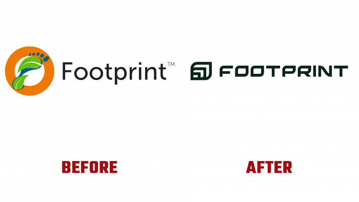
Until today, the logo looked like a footprint made in the form of green leaves and several circles that symbolized the toes. A footprint has been placed on top of an orange frame, which, as it were, should mean a certain sign that requires special attention. Nearby was a thin black inscription in a nice font with the brand’s name. But such a logo looks already tired, outdated, and outdated.
The choice fell on a new font and symbolic elements developed by the agency L + R.
The leaf, which has several others within its outline, creates volume and is well remembered by the simplicity of the design. The font deserves special praise because it is stylized like a leaf; all the letters resemble the shape of a plant in one way or another. Very neat lines, carefully calibrated height, and width of the distance between the elements contribute to a good impression and quick memorization of key images.
We can confidently say that the new one will make the brand more recognizable and will be associated with the success of the implementation of innovations. The brand’s mission is reflected in every element of the logo.
In general, the new look looks more solid and authoritative than the previous one. It doesn’t give the impression that this is the logo of a cheap plant-based foot care product. Now it is a full-fledged “face” of a company that cares about the planet and does everything possible to make the future of humanity healthy, prosperous, promising, and innovative.


