The technology company, Swile, was founded in France in 2018 by the former CEO and co-founder of Teads – Loicom Subeinar. In 2021, due to the transition to digital technology, a smart card was created. In keeping with the way of life, it simplifies the daily life of employees in companies and HR departments. This is an original, one-stop solution to combine all the benefits (many offers, discounts on public transport, food vouchers, gift certificates, and much more). It allows users to use their perks as they see fit, without wasting time looking elsewhere. Sharing accounts, exchanging payments, and zero fees are all the benefits of Swile. To create team spirit and cohesion, the application was launched simultaneously with the map. It allows you to seamlessly and instantly make communication, group discussions of events, planning events for a suitable occasion, including special occasions – anniversaries, weddings, name days. In addition, the program has access to an extensive network of ticket sales to amusement parks, cinemas, hotels, theaters. For those who use this application, there is an opportunity to receive personal discounts, various bonuses. Just as easily and quickly, you can find here sales of the brands you are interested in. All of these benefits provide real benefits.
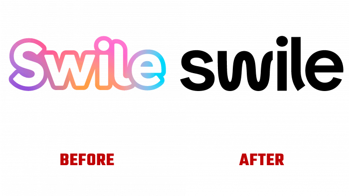
The new logo also stands out for its original look. In its creation, the original graphics and the overall spirit of the inspiring brand have been preserved. The chosen constant white uppercase font on a black background emphasizes the professionalism and seriousness of the entire company.
The font chosen for the logo – such as SK Curiosity Heavy by Salih Kizilkaya – is especially effective. Each letter is made with confident, smooth curves. The redesigned W and L add personality while softening the seriousness a bit while making it memorable and legible. The shape of the W resembles a smile, which makes the logo look less harsh and elicits the same smile in return. Due to its attractiveness, it has been chosen as a sign of application. The letter is embedded in a rainbow frame that shimmers all the time. The sign itself is made dynamic, transmitting energy and permeating the whole company with it. Creativity and professionalism ensured the required perception of the logo. The simplicity and conciseness of the logo are in line with current trends.


