Switchboard, the national LGBTQIA+ support line renowned for providing a safe and confidential space for individuals to explore sexuality and gender identity issues, has introduced a new visual identity. This rebranding effort, highlighted by the new Switchboard logo, aims to more accurately represent the organization’s core mission of fostering open communication and offering support to anyone, anywhere in the country, at any stage of their journey.
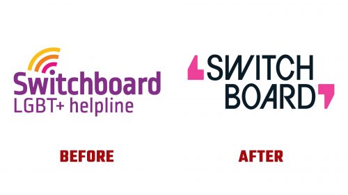
The transition from the old logo, which utilized Ropa Sans and incorporated a Wi-Fi signal suggestive of a telecom company rather than a support service, to the new design marks a significant shift in visual strategy. The redesigned logo features enlarged speech bubbles, symbolizing the essence of dialogue and exchange, a fundamental aspect of Switchboard’s services. While the new design intends to emphasize communication and conversation, the execution presents a unique take with slanted characters “W” and “A,” mirroring the angles found in the speech bubbles.
This innovative logo approach, however, ventures into territory that may be seen as trying to achieve uniqueness at the expense of clarity. Due to their unconventional proportions, the speech bubbles resemble single quotation marks. While aesthetically pleasing, the vintage badge-inspired speech bubbles may not immediately be recognized as symbols of conversational exchange.
In application, the speech bubble motif is expanded upon by incorporating illustrations, patterns, and animations, adding depth and enjoyment to the brand’s visual language. These elements effectively suggest various narratives and voices, moving closer to diverse conversations within a supportive community. The use of vibrant colors and engaging illustrations, including whimsical depictions like two frogs on the phone, injects life and personality into the brand, making Switchboard appear more approachable and relatable.
The branding also incorporates Family Type’s Athletics typeface, contributing to the identity’s dynamic and inclusive feel. This choice of typography, along with the lively color scheme and creative illustrations, positions Switchboard as a vibrant, empathetic entity committed to listening to and supporting the LGBTQIA+ community.
The new Switchboard logo and brand identity reflect a deliberate effort to convey the organization’s dedication to providing a non-judgmental, empathetic space for individuals to discuss their feelings, relationships, and questions regarding sexuality and gender identity.


