Tailwind facilitates social media marketing by automating the most complex areas, creating a comfortable environment for smart and fast growth. The ease of use of the resource over the years of its existence has been appreciated by millions of users. To expand its user base and create a brighter, clearer visual identity, Tailwind has refreshed its corporate identity for its 10th anniversary with the help of creative designers from the Bruno studio. The update made it easier to get acquainted with the service’s capabilities, its mission, and its philosophy. Visualization demonstrates how to save users time coming up with new ideas, creating and planning their pages on social networks without experience, guessing which options will be effective and which will not. With Tailwind, photo, and design in seconds without skills, automatic personalization and publishing, optimization, and much more.
The new corporate identity and changes in the logo did not become a cardinal rebranding. Bruno has carried out an update that retains the brand’s recognition and history, its core identity. It touched on the logo and appearance, style, tone, and presentation of the company, which was taken from top to bottom in all directions of the visualization. The color gamut has been reimagined with a modern digital rendition that adds richness, saturation, and clarity to hues. New themes and original graphics have shaped a growing and successful development company’s desired perception while maintaining its relevance.
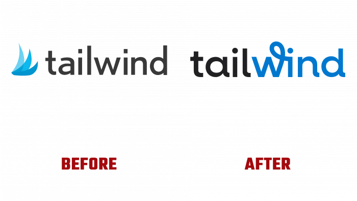
The updated visualization has increased the credibility and credibility of the current users, allowing them to attract the attention of new ones. The logo has become more modern. He acquired laconicism, which conveyed the information load to the visual symbolism. Keeping the text graphics in the brand name, the logo acquired the saturation of its primary colors – black and rich deep blue. The various shades of blue used to create the mark in the past logo have been removed along with the mark itself. The text was chosen of a different type, close to the original version, but all the letters are in small uppercase. Letters “a” and “d” are variants of the recipe. Together with “l,” “n,” they acquired attractive “tails.” “W” – created according to an individual project with a loop at the top, typical for connecting letters in handwriting. Part of the name – “wind” is done in deep blue. The horizontal sequential combination of black and blue creates an attractive perception of the logo as a single composition of two words.


