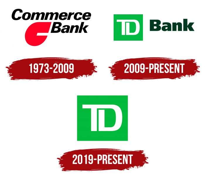
The TD Bank logo is a prototype of a safe full of money. While inside, they grow and multiply. The emblem promises clients transparency and legality of transactions, financial benefits, and pleasant bonuses when investing in a bank.
TD Bank: Brand overview
| Founded: | February 1, 1955 |
| Headquarters: | Toronto, Ontario, Canada |
| Website: | td.com |
Meaning and History
Thanks to its huge number of branches, TD is considered one of the largest banks in North America. Therefore, its square green logo is known almost everywhere – from Florida to Maine. The financial institution uses the official branding of its parent company, Toronto-Dominion Bank. In turn, that owns a large number of divisions because it has grown by acquiring other organizations. Its brands share a common identity that is built on a consistent system of visual signs.
What is TD Bank?
TD Bank is a credit and financial institution from the USA, which got its current name in 2008 after merging with Commerce Bancorp. It is part of the Canadian corporation Toronto-Dominion Bank, which conducts business in various countries worldwide using the TD brand. The predecessor of the American division of the company was Portland Savings Bank, which started operations in 1852 and was later renamed Banknorth.
1973 – 2009
Before Commerce Bank became part of TD Banknorth, it had a logo with a big red “C.” The capital letter was shaped like a flying drop. Above was the name of the organization, written in black italics, sans serif.
2009 – today
After the merger of Commerce Bank and TD Banknorth, a completely new brand was created – TD Bank. The abbreviation, in this case, stands for Toronto-Dominion. The combined company had to ditch the “C” symbol and adopted a different color scheme. As a result, she has an emblem in a light green square with white letters “T” and “D.” The second part of the name is located slightly to the right. This is the dark green word “Bank” in bold. On the website and in advertisements, it can be supplemented with a slogan.
The design and strategy of the TD brand were developed by the Canadian studio Shikatani Lacroix. She had a specific challenge: to create a universal visual identity that would suit both the parent conglomerate and its subsidiaries.
2019 – today
The symbol with the letters “TD” turned out to be so successful and memorable that the bank began to use it separately from the wordmark. The green square does not need any additions – it is the basis of the corporate identity.
Designers have filled the TD Bank logo with visual metaphors. Even its quadrangular shape symbolizes discipline and order because a square is a “stable” figure, equal on all sides. Connecting letters with a common white line represents consistency and connection. Therefore, both a clear geometry and a special ligature have a double meaning.
TD Bank: Interesting Facts
TD Bank, also known as The Toronto-Dominion Bank, has a long history and plays a big role in the banking world. Here’s a simpler look at what makes
- History: TD Bank started in 1955 when The Bank of Toronto and The Dominion Bank merged. Both banks have been around since the 1800s, so TD Bank has a deep-rooted history.
- Environmentally Friendly: TD Bank was the first bank in North America to become carbon-neutral in 2010, which shows that it cares about the environment.
- Banking Across Borders: TD Bank makes it easy for customers to bank in Canada and the U.S., which is unique.
- Supportive and Diverse: TD Bank focuses on community service and diversity. It is known for backing LGBTQ+ communities and pushing for fairness and inclusion.
- Customer First: Nicknamed “America’s Most Convenient Bank,” TD Bank has long hours, opens on weekends, and welcomes dogs. They focus on making banking easy for everyone.
- Arts and Culture: TD Bank supports arts programs like the TD Grade One Book Giveaway and the TD Toronto Jazz Festival, showing that it is about more than just banking.
- Growing in the U.S.: Since the late 2000s, TD Bank has been quickly expanding in the U.S., especially on the East Coast. It’s now among the top 10 largest banks in the U.S.
- Digital Banking: TD Bank specializes in online and mobile banking, ensuring customers have a smooth digital experience. Its tech is constantly updated to stay secure and user-friendly.
- Worldwide Operations: While TD Bank is a big name in Canada and the U.S., its parent company operates globally, including Europe and Asia-Pacific. This allows it to serve a wide range of customers.
- Giving Back: Through the TD Friends of the Environment Foundation, TD Bank supports local environmental projects and promotes green practices, showing their commitment to the planet and communities.
In short, TD Bank’s commitment to history, innovation, community support, and environmental sustainability makes it a notable player in the financial industry in North America and worldwide.
Font and Colors
The letters “TD,” short for Toronto-Dominion, looks more like a stylized monogram than full lettering. The expanded version of the logo, which has a wordmark, uses the Frutiger UltraBlack font developed by Adrian Frutiger’s typographer.
The green color went to the American brand from one of its predecessors – TD Banknorth. It is represented in the character system in two shades: darker British Racing Green (# 003F2D) and lighter Apple (# 54B848). In addition to symbolizing vitality and money, this color makes TD Bank unique and differentiates it from other US financial institutions.
TD Bank color codes
| Apple | Hex color: | #54b948 |
|---|---|---|
| RGB: | 84 185 72 | |
| CMYK: | 55 0 61 27 | |
| Pantone: | PMS 354 C |


