


![]()
Any business, institution, or service-connected with technology in its name will always have a visual solution that expresses innovativeness, modernity, and novelty.
This is how the world of marketing works. To make a product or service as attractive as possible, it is necessary to get close to the target audience and show how promising the choice in favor of the enterprise is. And putting themselves in the place of the potential client, marketers, developers, designers are trying to reflect the brand’s philosophy, convey values, and effectively present the company in the most favorable light.
Returning to the theme of technology, an important aspect of design decisions is the right choice of font and the definition of the correct minimalistic form of the logo.
A good example of a successful visual image is the brand Tech Central. Creative agency For The People has truly made a design for people from people.
The brand’s logo, which is a reflection of the innovative district in Sydney, combined the best qualities of modern creative design.
It should be noted that this district is a conglomeration of six districts that are home to interesting start-ups, innovative institutions, including a leading research hospital and 100 research bases and centers of excellence.
![]()
In the future, Tech Central wants to attract 25,000 students to support large-scale research while creating innovative jobs and occupying 820,000 square feet of office space.
The brand identity should reflect current trends in science, discovery, and the historical path and be appealing to international investors. As envisioned, Tech Central is a major co-working platform connecting different tech centers worldwide.
The brand identity is like a canvas that shows the symbiosis of people, places, culture, and technology. Six neighborhoods are six different stories, paths to success. The typographic representation of the streets and corners of the region formed the basis of the visual identity, which was a bold decision, but in fact, an excellent advertising move.
The monogram contains the letters T and C. The trick is that the letter C itself, made in black, hides the letter T in a gap.
Variations of fonts are also presented, from thin and elegant to bold and massive.
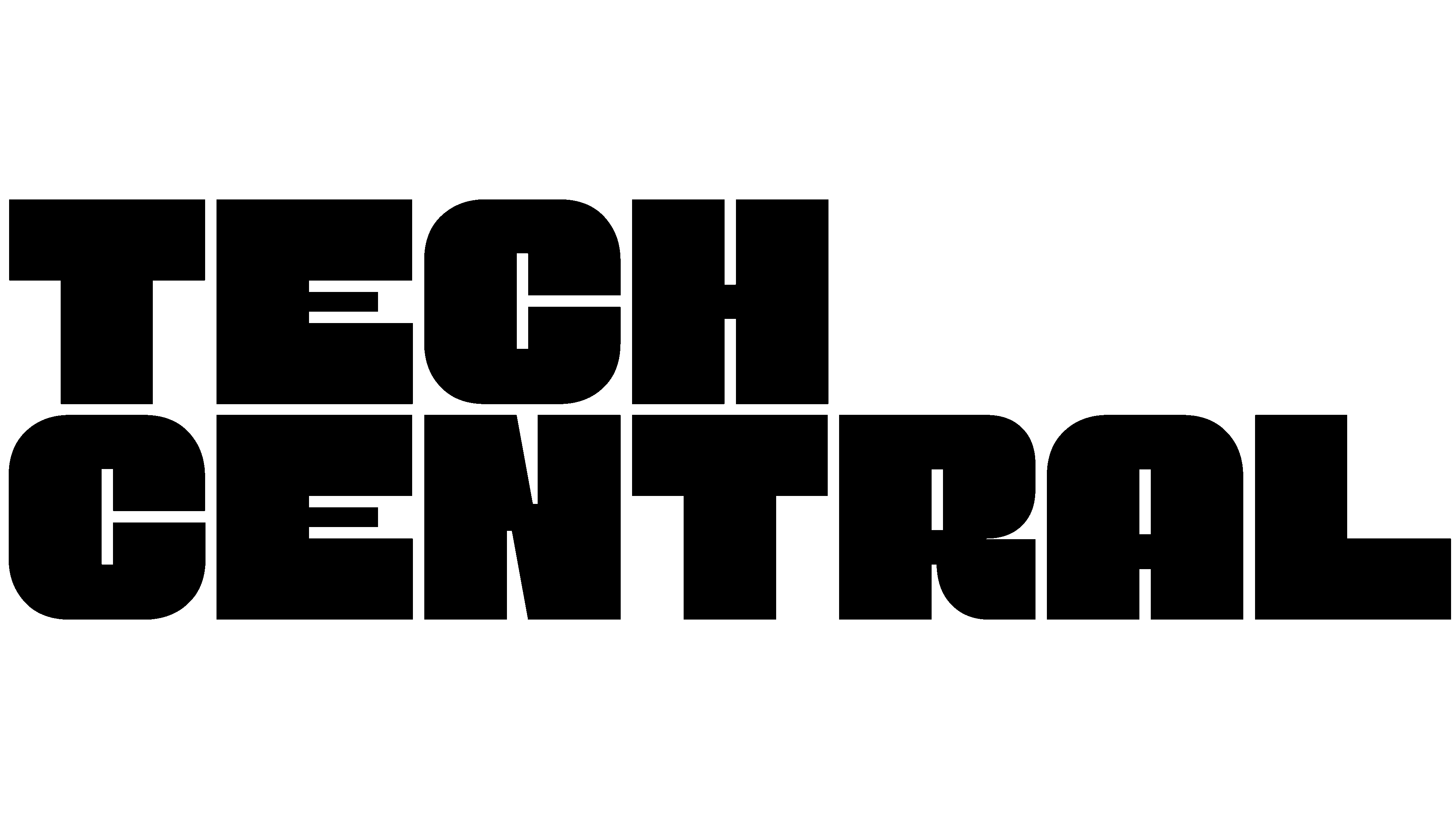
Overall, the logo is a typographic version. Aside from the accent graphic design, there are no more highlights. Well, except for the atypical arrangement of the letters in three tiers in the shape of a square.
This is intended to create the impression of a concentration of large scientific research technical bases in the region.
Just a logo in this form the most logical and organic looks on any media and objects of external advertising. It is balanced in form and color because the garish multicolored details will distract from the essence of the image.
But the association with blocks, interrelated elements, processes, and structures is quite natural and unobtrusive. There is a sense of the integrity of the image, and this is the main thing that Tech Central needs to show to its target audience.