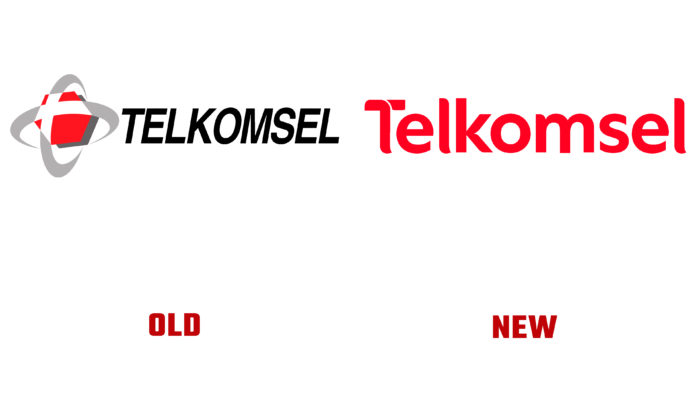
After the successful launch of the 5G service, the state operator introduced a new logo.
Telkomsel has been operating in Indonesia for 26 years and is changing its logo for the first time. In addition, the operator is going to optimize its corporate identity. The new logo is inspired by Indonesian culture and features a batik pattern. According to company president Hendri Mulya Syam, the new style should be the beginning of the next chapter in Telkomsel’s work.
The logo was unveiled on June 18, in honor of the 26th anniversary. The design used for the logo should be associated with eternal values for the Indonesian people and, at the same time, represent hopes for a successful future for the mobile operator.
The logo is made in red, which is inherent in most mobile operators in Indonesia. The corporate identity change is expected to be the starting point for the digital transformation process.
In addition to the logo change, Telkomsel has updated the names of some of its products: Simpati, Kartu As, and Loop, which have become part of the Telkomsel Prepaid. In turn, Telkomsel Prepaid and Kartu Hallo merged to form Telkomsel Hallo. Thus, the company is trying to optimize its products to make them more convenient for customers.


